Google Docs Function - Template Guide
🔴 On2Air Docs has been shutdown to focus on our On2Air Backups Airtable app Learn more about automated Airtable backups - on2air.com
The Google Docs Template Guide is used to setup the Google Docs Function. The Google Docs Function allows you to automatically create documents inside Google Docs using your Airtable data. You can generate single page and multi-page documents that display a single record or list of records from your Airtable base. It will also automatically upload the newly created PDF file back into your Airtable base in an Attachment file and the Google Doc URL into a URL or Text field. Use Cases: Invoices, Quotes, Contracts, Form Entries, Reports, and more
Features:
- Automatically generate documents with your Airtable data
- Create single or multi-page documents
- Bulk create documents for multiple Airtable records or create documents per single record
- Save as a PDF back to an Attachment field in your Airtable base
- Save the Google Doc URL back to a URL or Text field in your Airtable base
- Tables in your document automatically created to match the number of records needed
- Add advanced formatting with specific in-document templates for tables, images, links, content, and grids.
- For advanced documents, you can set up multiple document templates based on conditionals from your Airtable data and you can use the custom formatting templates inside your document for Tables, Text, Numbers, Dates, Images, Links, and Grids.
Table of Contents
-
Templates Overview
-
Basic Document Setup and Overview
-
Tutorials
-
Basic Merge Fields & Simple Table
-
Step 1 - Create Your Google Template
-
🎥How to Create the Google Docs Quote Template
-
Step 2 - Create Your On2Air Docs Automation
-
🎥How to Configure Your On2Air Docs Automation
-
Step 3 - Test and install your On2Air Docs automation function
-
Pre-Made Google Docs Templates
-
Simple Table Syntax
-
Simple Table General Notes
-
Simple Table Parameters
-
Advanced Table Syntax
-
Overview
-
{{#table}}{{/table}}
-
{{#header}} {{/header}}
-
{{#body}}{{/body}}
-
{{cell}} or {{#cell}}{{/cell}}
-
{{text}}
-
Advanced Table Parameters
-
{{#table}}{{/table}} Parameters
-
{{header}} {{/header}} Parameters
-
{{#body}}{{/body}} Parameters
-
{{#cell}}{{/cell}} Parameters:
-
{{text}} Parameters:
-
Merge Fields
-
List
-
Image
-
Using an Image Placeholder:
-
Using the {{image}} merge field
-
Using {{grid source}} for multiple images
-
Link
-
Paragraph
-
Heading
-
Number
-
Date
-
Grid
-
Advanced Grid
-
Conditional Formatting - IF statements
-
More Examples
-
Advanced
-
Known Issues
-
Shapes in Google Docs
Templates Overview
Section titled “Templates Overview”Basic Document Setup and Overview
Section titled “Basic Document Setup and Overview”⭐
To start using On2Air Docs, you’ll first need to create your template in Google Docs. You can use our tutorial below with templates to help you get started.
The Google Docs Function in On2Air Docs enables you to create documents that incorporate your Airtable data.
The Airtable data replaces merge fields in your Google Doc template. It’s conceptually similar to a mail merge, but much more powerful. The merge field is the fundamental way to add Airtable data to your document. Each merge field is replaced by the relevant Airtable data when it is merged.
The most basic version of a merge field is your Airtable field name wrapped in curly braces. These merge fields will be replaced with the content in that Airtable field.
Basic Example
Copy
Quote Created For: {{Client Name}}Quote Created On {{Quote Date}}This example will pull data from the “Client Name” and “Quote Date” Airtable fields to populate the document. The final result would look something like:
Copy
Quote Created For: Jane DoeQuote Created On 4/18/2023Advanced Example
In Airtable:
- You have an Invoices table that you want to generate invoice documents from
- You have a Linked Record field to the Companies table with the Company Name field and you have Lookup fields for the Address and Email.
In Google Docs:
- You create a template file
- You then add the merge fields for {{Company Name}}, {{Address}}, and {{Email}}
- You position these merge fields exactly where you want the final data to be in the document
The final Google Doc Template could look like the below example. Each instance of curly braces is a merge field that will be replaced by data from the Airtable table.
Tutorials
Section titled “Tutorials”Basic Merge Fields & Simple Table
Section titled “Basic Merge Fields & Simple Table”The tutorial will walk you through:
- Making a copy of the Peak Commercials - Quote Template document
- Making a copy of our Peak Commercials - Demo Airtable base
- Setting up the Google Docs function in On2Air
- Using different merge fields in the document
- Viewing the output from Airtable
For this tutorial we are the imaginary company Peak Commercials. We are creating a Google Doc template so we can more easily create quote estimates for our customers.
In this example we will walk through the following merge fields:
- Basic merge field
- Image merge field with placeholder image
- Date merge field with formatting
- Paragraph merge field
- A simple table
- Number merge field with formatting
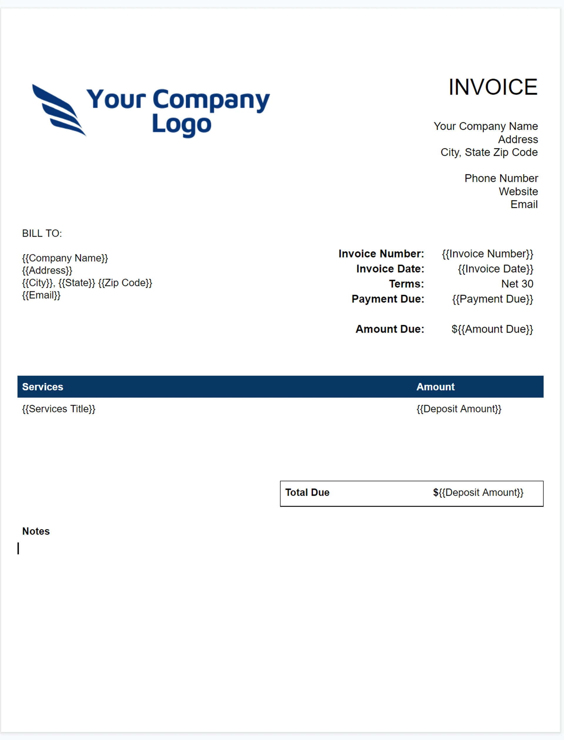
The input and output for the tutorial look like the following:
Google Doc Template with Table template
Merged Document with Airtable Data
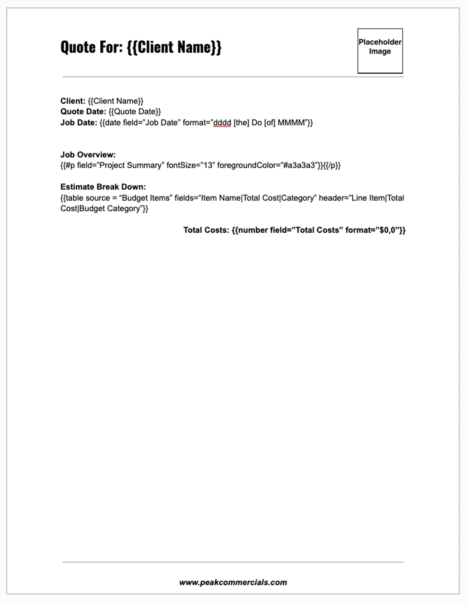
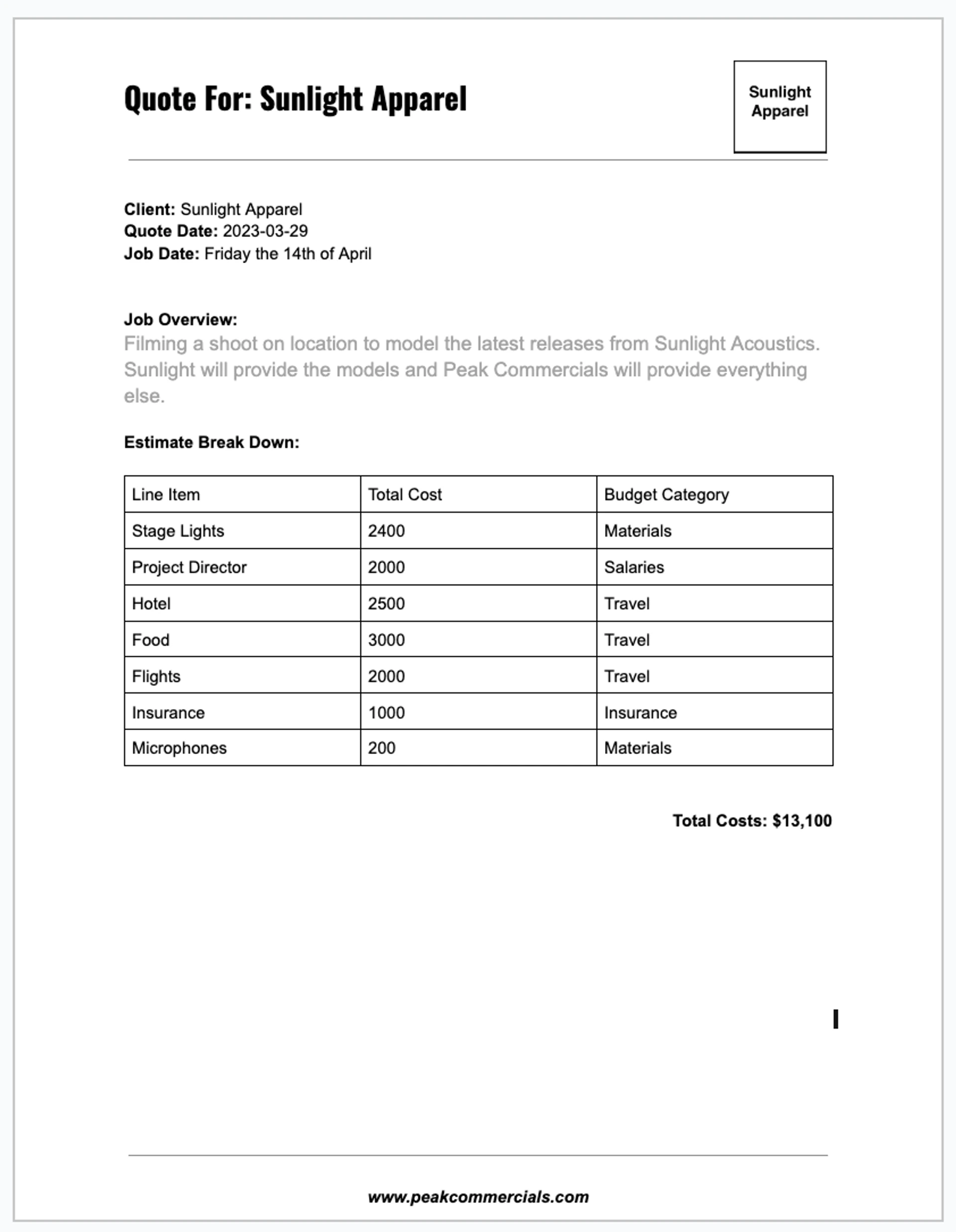
In example above, we’re bringing in Airtable data from 2 different tables - the Quotes table and the Items table. The Quotes table is the source for all of the merge fields except the table. The table uses the Budget Items field, which is a Linked Record that points to the Items table.
Step 1 - Create Your Google Template
Section titled “Step 1 - Create Your Google Template”Step-By-Step Guide
To begin the tutorial, make a copy of the Google template document and the Airtable base.
-
Peak Commercials - Quote Template document
-
Click here to view the document
-
Click “File” in the upper left hand corner.
-
Select “Make a copy” and copy the file to your own Google Drive
-
If “Make a Copy” is grayed out, it is likely because you are not logged in to your Google Account. Once you are logged in, you will be able to make a copy.
-
Peak Commercials - Demo Airtable base
-
Click here to view the Airtable base
-
To the right of the base name, click “Copy Base” to make a copy in your own Airtable account.
🎥How to Create the Google Docs Quote Template
Section titled “🎥How to Create the Google Docs Quote Template”This video will show you how to create your Google Docs Template and show you how an Airtable base might be set up.
Step 2 - Create Your On2Air Docs Automation
Section titled “Step 2 - Create Your On2Air Docs Automation”🎥How to Configure Your On2Air Docs Automation
Section titled “🎥How to Configure Your On2Air Docs Automation”This video will show you how to configure the automation in On2Air Docs. Before this step, you need to create your Google Docs template.
Step-By-Step Guide
-
Click “Create New Action”
-
Select “Google Docs Create/Export”
-
Configure the function
-
Click “Add Configuration”
-
Source Connection
-
Select your Airtable Connection
-
Source Configuration
-
Base - Select your Airtable base. In this case, it should be “Peak Commercials - Demo”
-
Table - Select “Quotes”
-
View - Select “Grid View”
-
Trigger Mode
-
Select “Checkbox”
-
Mode Configuration
-
Select Your Check Box Field - Select “Process Quote”
-
Trigger On - Select Check
-
Toggle Check Box On Trigger - Set to on. This should be green.
-
More Options - This is an advanced setting. It’s not needed for the purposes of this tutorial so you can skip it.
-
Google Docs Function Configuration
-
Google Connection - Select your Google Account
-
Source File Mode - Select “Use a Single Template”
-
Source File - Select the “Peak Commercials - Quote Template” document that you made a copy of earlier
-
Destination Folder - Select “Save All Files in a Single Parent Folder”
-
Destination Folder - Select the folder that you want your merged files to be saved in.
-
Destination Folder URL Storage Field - Leave blank, skip for now.
-
New File Title - Enter {{Quote Name}} into this field. That is the merged field that will name the document.
-
Source File URL Storage Field - Leave blank, skip for now.
-
Merge Field Output - Select “Always Merge Fields”
-
Merge Output URL Storage Field - Select “Merged Google Doc URL”
-
Delete Previous Merged File - Set to on. This should be green.
-
Export File - Select “Export Merged File”
-
Exported Format - Select “PDF”
-
Exported File Storage Field - Select “Quote PDF”. This is where the actual PDF will be stored as an attachment
-
Export Placement - Select “Remove all existing attachments then attach new one(s)
-
Save Exported File In Google Drive - Set to on. This should be green.
-
Save Exported File Storage Field - Select “PDF Url”. This will save a link to the PDF in Google Drive.
-
Delete Previous Exported File - Set to on. This should be green.
-
File Permission
-
You can skip this for now.
-
Advanced Settings
-
You can also skip this for now.
-
Click “Save Action Function Details”
Step 3 - Test and install your On2Air Docs automation function
Section titled “Step 3 - Test and install your On2Air Docs automation function”-
In your Peak Commercials Airtable base, go to the Quotes table. Check the box in the “Process Quote” field. This must be done prior to testing the function. The function will only run if one of the checkboxes is checked.
-
Test the Function
-
Go back to On2Air and click “Test Function” next to Configuration.
-
Click the “Test Function” button.
-
You should see a box titled “Function Results” with the content “Function ran successfully”
-
If you do, woo! You have your first function almost set up. Continue to “Installation” to finish the set up process.
-
If you don’t, double check you have one of the “Process Quote” checkboxes checked.
-
Install the Function
-
Click “Installation”
-
Set “Enable” to on. This should be green.
-
Scheduler Setup
-
Run Scheduler - Set to on. This should be green.
-
Frequency - Select “Instant”
-
Click “Save Scheduler Settings”
-
Celebrate!
-
You have your first function set up!
-
In your Airtable base, when you click the checkbox in “Process Quote”, the function will run and generate your merged documents.
Pre-Made Google Docs Templates
Section titled “Pre-Made Google Docs Templates”To help you get started you can copy one of our Google Docs pre-made templates.
You will need to replace the placeholders with your field and table names and then customize the document to fit your needs.
💡
Simple Table Syntax
Section titled “Simple Table Syntax”There are two types of tables. The simple table described here, and the advanced table described below. This section covers the simple table the parameters you can use to customize it.
Simple Table General Notes
Section titled “Simple Table General Notes”Tables are generated where the placeholder syntax is written. And the length of the table is determined by what data you are populating it with. Therefore, it’s possible a table will run from one page to the following. If you want to avoid this you must place the table syntax where it will not run to the next page.
Simple Table Parameters
Section titled “Simple Table Parameters”source
Source is the Airtable field name of the data source.
The source parameter supports following field types: MultiSelect, Lookup, Rollup, Linked Record.
‣
Expand to See Further Details for the Field Types supported by Source
fields
Fields are the field names that you want to populate your table with. These values are separated by the “|” (pipe) character.
header
Header sets the values for what will appear in the table header. These values are also “|” separated. The header values do not have to match your Airtable field names. Instead, they can be any text.
Example - Source, Fields, and Header
Copy
{{table source = “Budget Items” fields=“Price Per Unit|Actual” header=”Unit Price|Actual Cost”}}This example has a source of Budget Items. From the demo Airtable table above, Budget Items is a Linked Record. The Fields values are fields from table that Budget Items is linked to. The header values are just text values. In this case you can see that they are not identical with the field values.
borders
Borders are on by default. You can use the borders parameter to customize them. You can remove them, choose which sides to include, and customize the design of the borders.
All of the settings for borders are contained inside a single pair of quotes. The different settings options are further divided by semicolons.
‣
Expand to see further options for Borders
columnWidths
Set your column widths in inches. You must specify a value for each column in your table. You can also leave a value empty and that column will take up the remaining space.
Example - All Column Widths Set
Copy
{{table columnWidths="0.5,1,1"}}Example - Column Takes Up Remaining Space
Copy
{{table columnWidths="1,,1"}}This will set the 1st and 3rd columns to 1 inch, and the 2nd column will use the remaining space
sort
Sort the table data prior to display. “field” and “order” are required options for sort.
The list of options for sort are contained in a single pair of quotation marks and separated by a semicolons
The options for order are: asc, desc (Representing ascending and descending respectively)
Example
Copy
{{table sort="field: Unit Price; order:asc"}}This table will be sorted by the field Unit Price in ascending order
separator
set to a value to use for determining how source and fields parameters are separated
Example
Copy
{{table source="Field A,Field B" separator=","}}Instead of having the source field separated by “|”, which is the default, this table’s source values are separated by commas.
This is useful if you have field names that contain “|” in them.
weightedFontFamily
Change the font and weight of font of the text.
fontFamily - Select from available Google Fonts
weight - Value between 100 and 900 to determine the weight (i.e. thickness) of the font. 400 is default
Example
Copy
{{table weightedFontFamily=”fontFamily: ZCOOL KuaiLe; weight: 600”}}fontSize
The size of the font, in inches
Example
Copy
{{table fontSize="14"}}grouping
group records from Multi-select or Linked record fields
Example
Copy
{{table .....table config.... grouping="GroupFieldName"}}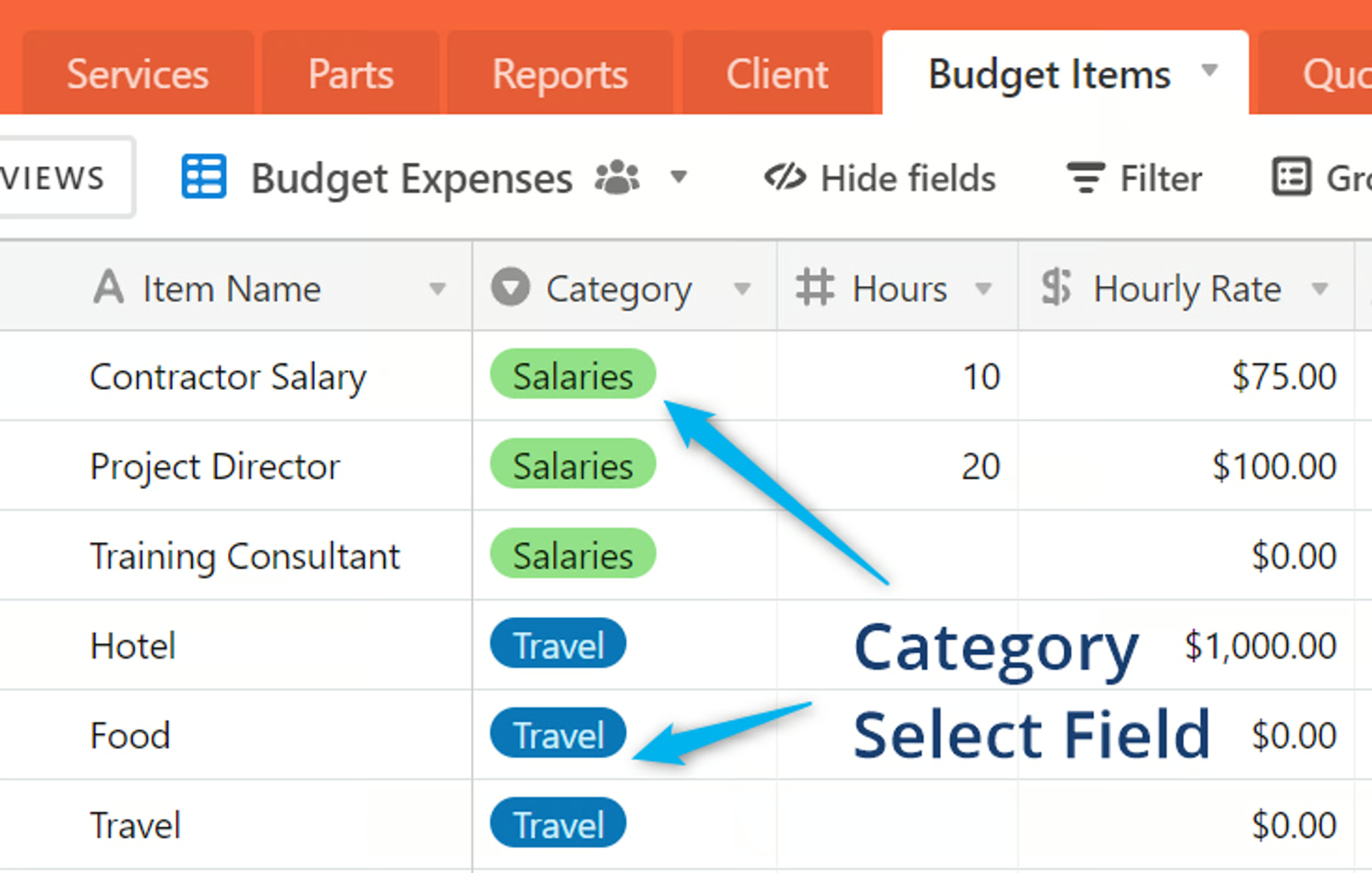
Your Airtable base with a select field
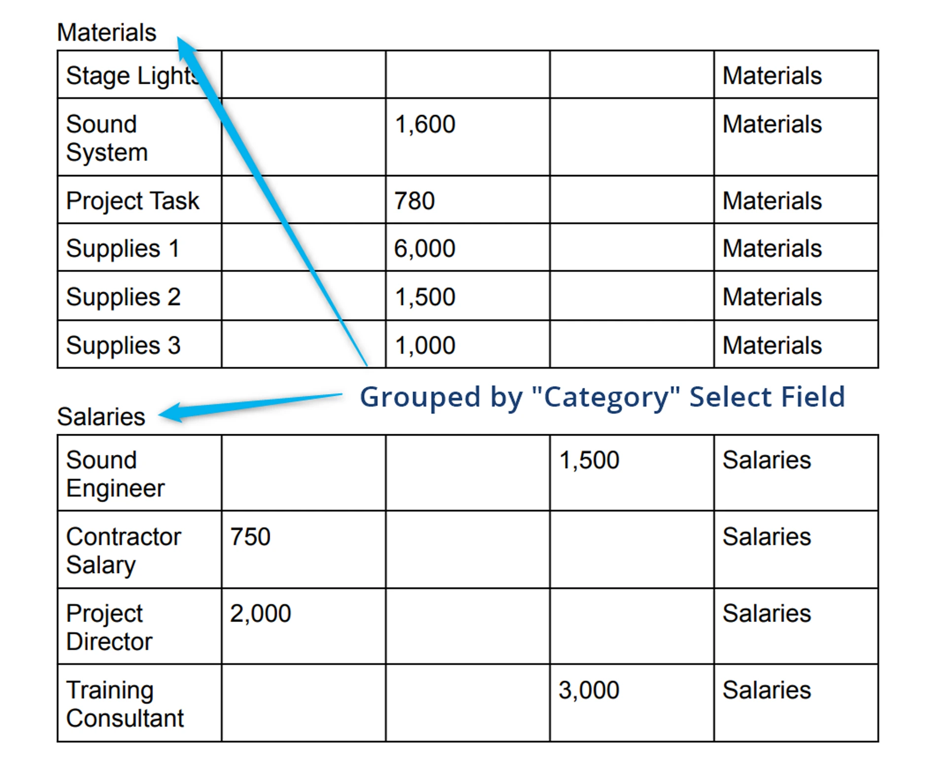
Document with records grouped
spread
Spread out groupings from your grouped Multi-select or Linked Record field
If using a Multiselect field or a Linked Record Field with Multiple Records enabled, you can “spread” out the groupings to each individual item. Instead of how Airtable does groupings where it will group multi-select items only if they have all the exact same items, this will group on the individual items - which means records will show up in multiple tables if has multiple items of the group field.
Example
Copy
{{table .....table config.... grouping="field: GroupFieldName; style:[bold=1|fontSize=22]; label: GroupLabelField; sort: GroupSortField; order: desc; separator: \n\n; sep_style:[]; spread: 1"}}Advanced Table Syntax
Section titled “Advanced Table Syntax”(Documentation is a work in Progress for Advanced - Book a Support Call if looking to do more advanced table use case)
Overview
Section titled “Overview”Advanced tables are composed of the following components:
{{#table}}{{/table}}
Section titled “{{#table}}{{/table}}”Determines the source of the table
{{#header}} {{/header}}
Section titled “{{#header}} {{/header}}”Determines the header values
{{#body}}{{/body}}
Section titled “{{#body}}{{/body}}”Determines the display inside the table cells
{{cell}} or {{#cell}}{{/cell}}
Section titled “{{cell}} or {{#cell}}{{/cell}}”Determines the content of individual cells. These denote the values within a given column for the table. They are nested inside of {{#body}}. Using advanced cells allows you to customize the content.
{{text}}
Section titled “{{text}}”These enable additional customization of an individual cell. They are nested inside of the advanced {{#cell}}{{/cell}}
Full Example
Copy
Advanced Table Parameters
Section titled “Advanced Table Parameters”{{#table}}{{/table}} Parameters
Section titled “{{#table}}{{/table}} Parameters”source
The Airtable Column that is the source of data for this table. Generally this is a link record
Required.
borders
Determines which of the cell borders to display
columnWidths
Determines the width of each column, in inches.
Example
Copy
{{#table source="Linked_Record” borders=”sides: none” columnWidths="0.7,3,,,1”}}{{/table}}This table is pulling data from an Airtable table called “Table Data”. The borders have no sides. There are a total of 5 columns. The widths of each vary. By leaving the width for column three and column 4 blank, those columns will automatically take up the remaining width available
{{header}} {{/header}} Parameters
Section titled “{{header}} {{/header}} Parameters”values
A pipe delimited list of strings that represents the headers in each column.
style
Set the style settings for just the header. Common use cases include bolding the headers and adjusting the font size.
‣
Expand for further details on: bold, fontSize, italic, underline, and strikethrough
Example
Copy
{{header values="Name|Image|Notes|URL|Named Notes" style="bold:1; fontSize:18"}}This table will have headers called “Name”, “Image”, “Notes”, “URL”, and “Named Notes”. These strings are independent of the fields in the Airtable Table, and can be changed as desired. For example, “Image” could be switched to “Product Picture” and all of the table data will display the same. Only the header will change.
{{#body}}{{/body}} Parameters
Section titled “{{#body}}{{/body}} Parameters”evenColor
The background color for every even numbered row. Use HTML Hex color codes
Optional, default is white
oddColor
The background color for every even numbered row. Use HTML Hex color codes
Optional, default is white
oddFgColor
Foreground color of each odd row - use HTML Hex color codes
Optional. If left blank this parameter will default to black.
evenFgColor
Foreground color of each even row - use HTML Hex color codes
Optional. If left blank this parameter will default to black.
Example
Copy
{{#body evenColor=”#FFFFFF” evenFgColor=”#0A0A0A” oddColor=”#0A0A0A” oddFgColor=”#FFFFFF” }}{{/body}}This body will have alternating colors in each row. Every even numbered row will have a white background (#FFFFFF) and black text (#0A0A0A). Every odd numbered row will have a black background (#0A0A0A) and white text (#FFFFFF). As mentioned above, any valid HTML Hex color code can be used here.
{{#cell}}{{/cell}} Parameters****:
Section titled “{{#cell}}{{/cell}} Parameters****:”To use an advanced cell, create the cell and then add additional merge fields nested in the cell. This gives you a large degree of freedom to customize the exact content you want in the cell.
type
The content type that will be nested the cell
Valid options are: text, image, and link
Examples
Copy
{{#cell type="text"}} {{text value=”Item: \n” style=”bold:1”}} {{text field=”Item Name”}}{{/cell}}This cell contains two text merge fields. The first text merge field has a static value of “Item: “ followed by a line break, and it will be bold. The second text merge field is the content from the Airtable field “Item Name”. Combined they will display content that looks like the following:
Item: Stage Lights
{{text}} Parameters:
Section titled “{{text}} Parameters:”value
any static text value you want to use in your table. This value never changes. You can also use formatting such as \n to create separate lines.
field
The Airtable field that you want to merge into the template.
Example
Copy
Merge Fields
Section titled “Merge Fields”{{list}}
Inserts a list containing values from an Airtable field. The list can be values from a Lookup Field or a Multiple Select Field.
field
Specifies the Airtable field that contains the content to be inserted into the list. This can either be a Lookup Field from a Linked Record or a Multiple Select Field.
preset
Preset allows you to change the bullet style of the list.
‣
Expand the list to see all of the preset options
style
Sets the style for each of the list items. Options for style include bold and fontSize
‣
Expand to see further examples
Examples
Example 1
Copy
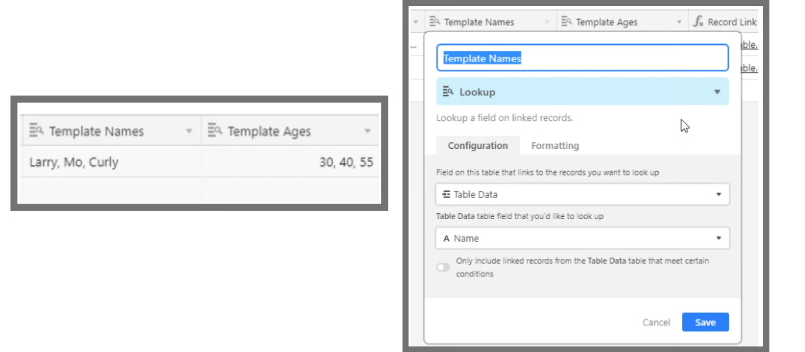
{{list field=”Item Name (from Budget Items)”}}The value for field is a Lookup Field from the Linked Record. In this example the Linked Record is “Budget Items”. The Lookup field looks up “Item Name” from the Linked Record. The Lookup Field should be formatted as a comma separated list of the values.
‣
In Airtable that looks like this (expand to see screenshots)
Example 2
Copy
{{list field=”Tags” preset=”NUMBERED_DECIMAL_NESTED” style=”bold:1; fontSize:18”}}The value for field is a Multiple Select field called Tags. Using the preset NUMBERED_DECIMAL_NESTED will style the bullets in the list as numbers instead of bullet points. The font will be bold and size 18 from the style parameter.
Insert an image or multiple images in a specific location in your document
There are 3 ways to insert images:
- Placeholder
- {{image}} merge field
- for multiple images, use {{grid source}}
Using an Image Placeholder:
Section titled “Using an Image Placeholder:”- Create a basic placeholder image
- This placeholder image should be the same size as the image you want to insert. If the image you want to insert is 250 pixels by 250 pixels, have your placeholder be that same size
- Insert your placeholder image into the location your document. Set it to the exact location you want your final image to be
- Right-click your image and choose Alt Text
- In the Title field, add the name of your Airtable Field Name surrounded by brackets
Example
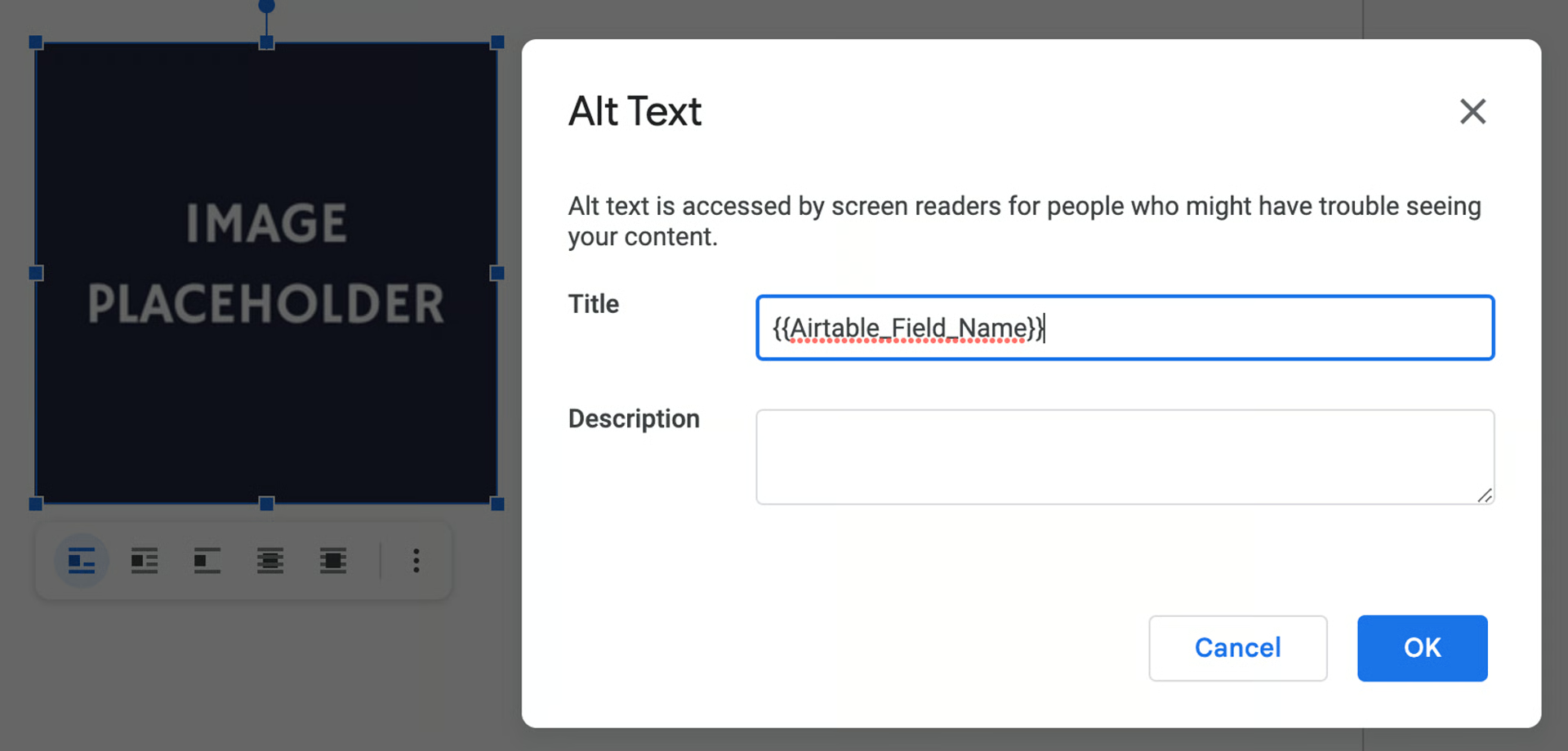
This is the view after right+clicking the placeholder image and selecting Alt Text. In this case, the image stored in the field “Airtable_Field_Name” will be inserted where the placeholder image currently is.
Using the {{image}} merge field
Section titled “Using the {{image}} merge field”Insert images from your Airtable base into your document.
{{image}} Parameters
field
Specifies which field to pull the image from. The Airtable field can either be an Attachment field, or a URL Field.
Example
Copy
{{image field="Quotes_Image"}}Using {{grid source}} for multiple images
Section titled “Using {{grid source}} for multiple images”If you need to display multiple images from a single Airtable Attachment field, you can use the {{grid source}} syntax. With this syntax, it will generate a Grid of all the attachment images. You can then add syntax to resize the images or re-order them using the additional syntax below.
Copy
{{grid source="AttachmentFieldName" type="image"}}
index
determines which order the image will be pulled from.
Use first, random, last, or the specific index value, starting from zero. For example, an index of 0 is equivalent to an index of first.
Example
Copy
{{image field="Quotes_Image" index="first"}}

{{image field="Quotes_Image" index="0"}}
Both of these merge fields are identical. They are both pulling the first image from the Airtable field Quotes_Image.
size
Specify the width and/or height in inches.
If only one is set, the other dimension will be determined by the original image dimensions ratio
Example
Copy
{{image size="width: 6.5; height: 4"}}OR{{width="2" height="2"}} if using multiple images
example:{{grid source="Document Attachments" type="image" width="2" height="2"}}
Regarding size for multiple images from a single Airtable field
if you only specify one “width or height” setting, the other images will scale accordingly
if you wanted to scale/use different image sizes for each image, you need to do each separately, instead of the {{grid}}
It will need to look like this where you specify the indexes of each image:
Copy
{{image source="AttachmentFieldName" index="0" width="2"}} {{image source="AttachmentFieldName" index="1" width="3"}}url
If the url parameter is specified the image will be pulled from that URL.
The url can either be another merge field, or it can be a static value.
The URL must be publicly accessible.
If both field and url options are specified, the image will be pulled from the URL.
Example - URL as a Merge Field
Copy
{{image url="{{Quote_URL}}"}}This image will link to the URL that is stored in the Quote_URL field.
Note that {{Quote_URL}} has quotation marks around it.
Example - Static URL
Copy
{{image url="example.com/cool_mountain.jpeg"}}This image field links to the hypothetical static URL example.com/cool_mountain.jpeg
{{link}}
This is used to insert your Airtable data as a link inside your document
field
The name of the Airtable field that contains the URL that you want to link to
label
Static text that will be displayed instead of the link.
Example
Copy
{{link field=”Quote_URL” label=”Visit Your Digital Quote”}}This link will display the text “Visit Your Digital Quote” and when clicked will open the URL that is stored in the Quote_URL field.
labelField
labelField does the same as label but accepts another Airtable field as input.
Example
Copy
{{link field=”Quote_URL” labelField=”Quote Name”}}This merge field will link out to URL stored in Quote_URL and will display the text stored in the Quote Name field.
foregroundColor
Sets the color of the link. Use HTML Hex color codes
Example
Copy
{{link field=”Quote_URL” labelField=”Quote Name” foregroundColor=”#00cc99”}}This link will now have a bright green color.
Paragraph
Section titled “Paragraph”{{#p}} {{/p}}
Creates a paragraph with content pulled from your Airtable field.
field
Specifies the field that contains the content you want inserted into the paragraph
Copy
{{#p field=”Project Summary”}}{{/p}}This will generate a paragraph that contains the content from the field Quote_Explanation
fontSize
Sets the fontSize of the text
Copy
{{#p field=”Quote_Explanation” fontSize="14"}} {{/p}}foregroundColor
Sets the color of the text. Use HTML Hex color codes
Copy
{{#p field=”Quote_Explanation” foregroundColor=”#4281f5”}} {{/p}}backgroundColor
Sets the background color of the paragraph. Use HTML Hex color codes
Copy
{{#p field=”Quote_Explanation” foregroundColor=”#4281f5” backgroundColor=”#20261d”}} {{/p}}style
The style parameter accepts a large variety of additional styling components. The style are enclosed in a single pair quotation marks and separated by semicolons.
‣
Expand for further details on: bold, fontSize, italic, underline, and strikethrough
Heading
Section titled “Heading”{{#heading}} {{/heading}}
Creates Headings. These headings will create the outline structure in Google Docs.
Please note that you cannot apply styling to headings without keeping them as a heading. If you apply a style they will be converted to a paragraph in order to apply that styling. If styling a heading is something you require, please contact the team to express support for this as a possible future feature.
field
The Airtable field that contains the content to be merged into the heading.
level
The heading level. Valid options: title, subtitle, 1, 2, 3, 4, 5, 6
Required.
Copy
{{#heading field=”Quote_Explanation_Title” level=”title”}} {{/heading}}{{#heading field=”Quote_Explanation_Subtitle” level=”subtitle”}} {{/heading}}The first heading’s content will be from the field Quote_Explanation_Title and it will be set at the title level.
The second heading’s content will be from the field Quote_Explanation_Subtitle and be a subtitle level header.
Number
Section titled “Number”Copy
{{number}}This merge field enables you to format data as a number
value
Sets the static text for number that you want to format.
field
The Airtable field that contains the content to be merged.
locale
Setting locale will change the formatting and currency symbol used. You set the locale by using the locale’s abbreviation code. The default is US formatting and $.
‣
Expand to view a list of common locales
format
Determines your number format. A few common examples:
Number
Format
Formatted Number
Explanation
10000
‘0,0.0000’
10,000.0000
Insert commas, go out to 4 decimal places
10000.1234
‘0[.]00000’
10000.12340
No commas, go to five decimal places. Because the number only has four decimals, a zero is added
-10000
‘(0,0.0000)’
(10,000.0000)
Format negative numbers in parentheses. Insert commas. Go out to 4 decimal places.
1000.234
‘$0,0.00’
$1,000.23
Inserts the currency sign. Rounds down to two decimal places. Inserts commas.
Numeral.js is used for the formatting. So any valid formats displayed in the Numeral.js documentation will work here.
Examples
Copy
{{number value=”7910” format=”0,0.00”}}{{number field=”Total Costs” format=”0,0”}}{{number field=”Total Costs” format=”$00.00”}}{{number field=”Total Costs” format=”$0,0.00” locale=”en-gb”}}{{number field=”Total Costs” format=”$0,0.00” locale=”ja”}}{{number field=”Total Costs” format=”$0,0.00” locale=”it”}}Each of these number fields contain the same data but are formatted differently. The outputs are:
- 7,910.14
- 7,910
- $7910.14
- £7,910.14
- ¥7,910.14
- €7.910,14
Copy
{{date}}This merge field enables you to format data as a date
field
The Airtable field that contains the content to be merged.
format
Determines the date format. A few common examples:
Input Date
Format
Formatted Date
2/8/2022
MM-DD-YYYY
02-08-2022
2/8/2022
D-M-YY
8-2-22
2/8/2022
dddd [the] Do [of] MMMM
Tuesday the 8th of February
On2Air uses Moment.js under the hood to format dates. Any valid format from Moment.js should be valid. You can see many examples here.
Adds all data from a field, linked table and will generate a grid table where everything is added. Most parameters from Tables are valid here. View Table documentation for styling parameters
Copy
{{grid}}
Examples:{{#grid source="Logo" type="image” size="width: 1.5” columns="2" max="10" sort="Name"}}{{/grid}}
This grid is generated from the Logo field. It will display up to the first 10 images stored in the Logo field. The grid will have 2 columns.
{{grid}} Parameters
source
The source of the grid. This is your Airtable field that will populate the grid. Similar to how the table works, if this value is a Link Record then you have access to the additional fields on the Linked Record.
type
The grid cell type. Available options: text, image, link, number, date
width
The width of each grid cell
columns
Used to specify how many columns are in the grid. The grid will wrap until it has reached the max number of items, or all of the items in the source. Whichever is lower.
For example, if your field has 10 items in it, but you set the max value (below) to be 3, the grid will only display 3 items. If you have columns set to three, all three items will display in a single row. If you have columns set to 1, there will be a single column that has three rows.
Default is 3
max
The max number of items to display.
Example
Copy
{{#grid source="Logo” type="image” size="width: 1.5” columns="2" max="10" sort="Name"}}{{/grid}}This grid is generated from the Logo field. It will display up to the first 10 images stored in the Logo field. The grid will have 2 columns.
Advanced Grid
Section titled “Advanced Grid”Advanced Grid extends the grid functionality similarly to how the Advanced Table extends the simple table.
In the Advanced Grid you create a template in a {{#cell}}{{/cell} field that is then populated for each value in the grid’s source.
Options:
source
The source of the grid. This is your Airtable field that will populate the grid. Similar to how the table works, if this value is a Link Record then you have access to the additional fields on the Linked Record.
type
The grid cell type. Available options: text, image, link, number, date
width
The width of each grid cell
columns
Used to specify how many columns are in the grid. The grid will wrap until it has reached the max number of items, or all of the items in the source. Whichever is lower.
Default is 3
max
The max number of items to display.
{{#cell}}{{/cell}}
A cell template that is then populated for each value in the grid’s source. You can only define one cell for the grid.
Styling and additional parameters are the same as for the Table’s Cells
Copy
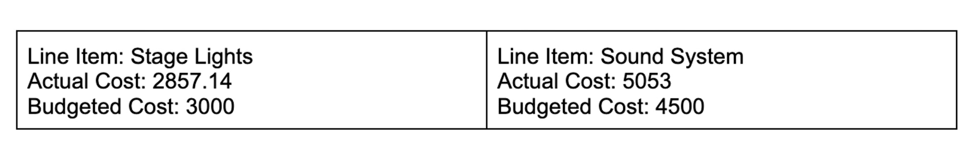
{{#grid source=”Budget Items”}} {{#cell type=”text” }} {{text value=”Line Item: “}} {{text field=”Item Name”}} {{text value=”\n“}} {{text value=”Actual Cost: “}} {{text field=”Actual”}} {{text value=”\n“}} {{text value=”Budgeted Cost: “}} {{text field=”Budget”}} {{/cell}}{{/grid}}This grid is populate from the Budget Items field. The cell has three different lines of text in it, separated by two line breaks (The “\n” character).
The text fields with “value” in them are static text. While the text fields with “field” in them are merge fields.
The result looks like:
Conditional Formatting - IF statements
Section titled “Conditional Formatting - IF statements”ifEq and ifVal
Used together these fields create a conditional that must be true for the merged field to be populate.
ifEq
The Airtable field that you are checking against.
ifVal
The field from ifEq must be equal to this value for the field to display
Example
Copy
{{text field=”Client Name” ifEq="Client Name” ifVal=”Client A”}}This text field will only display if the value Client Name is Client A
More Examples
Section titled “More Examples”These examples shows some ways to use the templates in your Docs
Copy
Advanced
Section titled “Advanced”For Advanced Users. View possible parameter options for the following:
Known Issues
Section titled “Known Issues”Shapes in Google Docs
Section titled “Shapes in Google Docs”There is currently a bug within Google Docs that impacts documents that contain a shape. It prevents Google Drive from being able to make a copy of the template document.
The resulting error message will look like the following:
Copy
Error on Function Test! Please re-configure and test again.Error[googledrive]:Can't copy file 1hv7pywqhMitwGuWLRfiAudHwhdqA68A0Qg_bxHv6Zyw - Advanced Table = Quote - Sunlight Apparel - 03-2023 - 1_5JqB7JLA8aH4v0TyX1Ehv2rJJLOGkI2 => Error: Internal ErrorIf you are experiencing this error message, check if your document contains a shape or drawing. If it does, try removing those and then testing your function again.
Go to  On2Air Help Center