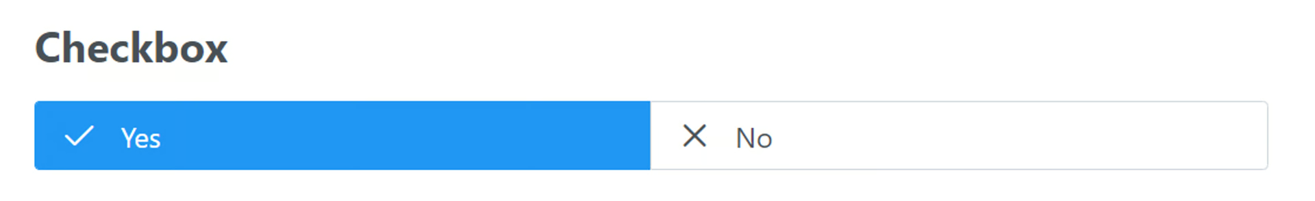
Checkbox
🔴 On2Air Forms has been shutdown to focus on our On2Air Backups Airtable app Learn more about automated Airtable backups - on2air.com
➡️
The Checkbox field is a single checkbox that can be checked or unchecked.
See more Fields in the Form Field Reference
-
How to Add a Field to Your Form
-
Field Configuration
-
Field Labels
-
Field Status
-
Change Checkbox Labels
-
Field Defaults
-
Default Value
-
URL Prefill Settings
-
URL Prefill Key
-
Extra Options (Advanced)
-
Danger Zone
How to Add a Field to Your Form
Section titled “How to Add a Field to Your Form”Here’s how to add Airtable Fields or On2Air Custom Fields to your Form
➡️
 How to Add Airtable Fields and On2Air Custom Fields to Your Form
Field Configuration
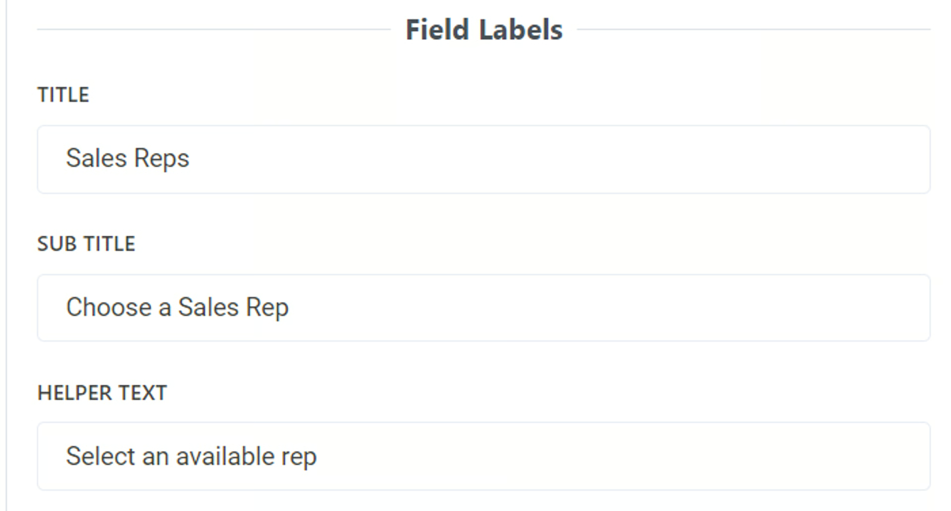
Section titled “Field Configuration”Field Labels
Section titled “Field Labels”Title
- Add a title to be displayed above the field as the main name. To leave blank, add a single space
By default, this is the name of your field in Airtable. You can use a different field name than your base and it will not affect the field name in your base.
Sub Title
- Add a subtitle to be displayed above the field. To leave blank, add a single space
You can use text in this field and you can use Markdown to increase text size, bold, or italics
Related:  Use Markdown with On2Air Forms
Helper Text
- Add helper text to be displayed below the field. To leave blank, add a single space
You can use text in this field and you can use Markdown to increase text size, bold, or italics
Related: Use Markdown with On2Air Forms
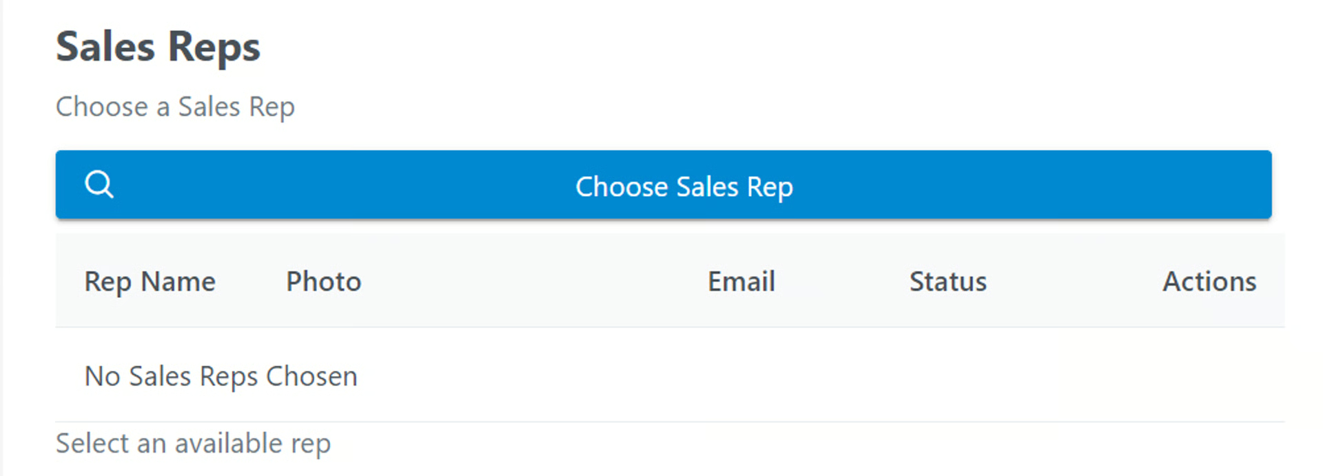
Example:
Field Status
Section titled “Field Status”- Optional Field - Determine how to this field is displayed. Standard Editable Field, but not required.
- Required Field - Determine how to this field is displayed. Standard Editable Field that is required.
- Disabled Field - Determine how to this field is displayed. Standard Field as Non-Editable.
- Display Field Content - Determine how to this field is displayed. Display Field as Text or other Displayable format (not editable).
- Hidden Field - Determine how to this field is displayed. Field is Included but not Visible.
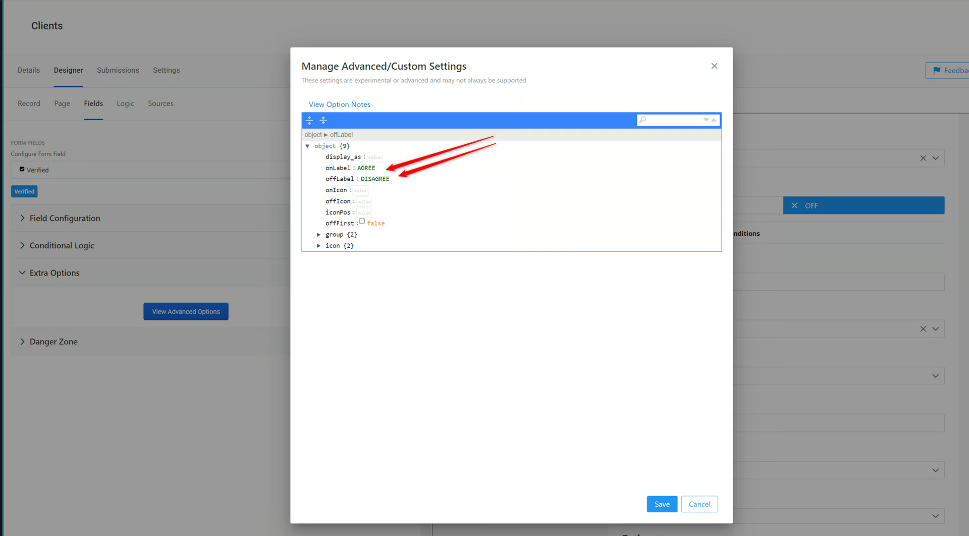
Change Checkbox Labels
Section titled “Change Checkbox Labels”By default, Checkboxes are labeled as ON and OFF with ON being Checked and OFF being Not Checked
You can change the labels on the Checkbox
- In your field menu, click the Extra Options menu, then click View Advanced Options
- Use the onLabel and offLabel settings to type in your desired labels
Field Defaults
Section titled “Field Defaults”Default Value
Section titled “Default Value”- Set a default value for this Field
For a Checkbox field, you can use true/false or 0/1 as Defaults
true = Checked
false = Not Checked
1 = Checked
0 = Not Checked
URL Prefill Settings
Section titled “URL Prefill Settings”URL Prefill Key
Section titled “URL Prefill Key”The Key used to set this field value from the URL (i.e. ?key=value). Remove key to disable URL Prefills for this field.
💡
Learn:  What is a URL Prefill (Pre-Populated Fields) and How to Use Them in On2Air Forms
  How to Add URL Prefills for Linked Records (Pre-Populate Linked Records)
Extra Options (Advanced)
Section titled “Extra Options (Advanced)”You can add additional formatting options to your form fields using the Prime React components library and JSON
View available components at www.primefaces.org/primereact
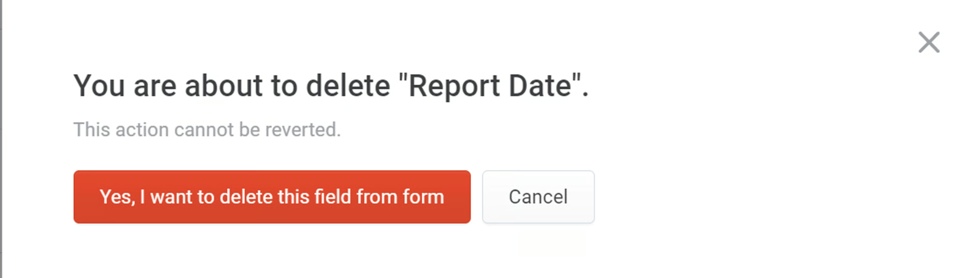
Danger Zone
Section titled “Danger Zone”Delete your field from the form
Click Remove
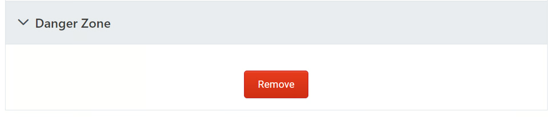
Click Yes, I want to delete this field from the form