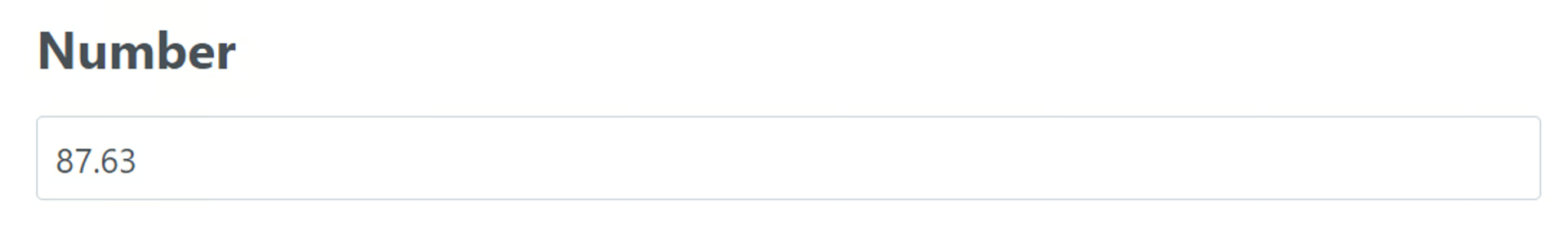
Number
🔴 On2Air Forms has been shutdown to focus on our On2Air Backups Airtable app Learn more about automated Airtable backups - on2air.com
➡️
The Number field in On2Air Forms allows you to display numbers in various formats.
See more Fields in the Form Field Reference
-
How to Add a Field to Your Form
-
Field Configuration
-
Field Labels
-
Field Status
-
URL Prefill Settings
-
URL Prefill Key
-
Extra Options (Advanced)
-
Number Properties
-
Remove Commas from Numbers
-
Danger Zone
How to Add a Field to Your Form
Section titled “How to Add a Field to Your Form”Here’s how to add Airtable Fields or On2Air Custom Fields to your Form
➡️
 How to Add Airtable Fields and On2Air Custom Fields to Your Form
Field Configuration
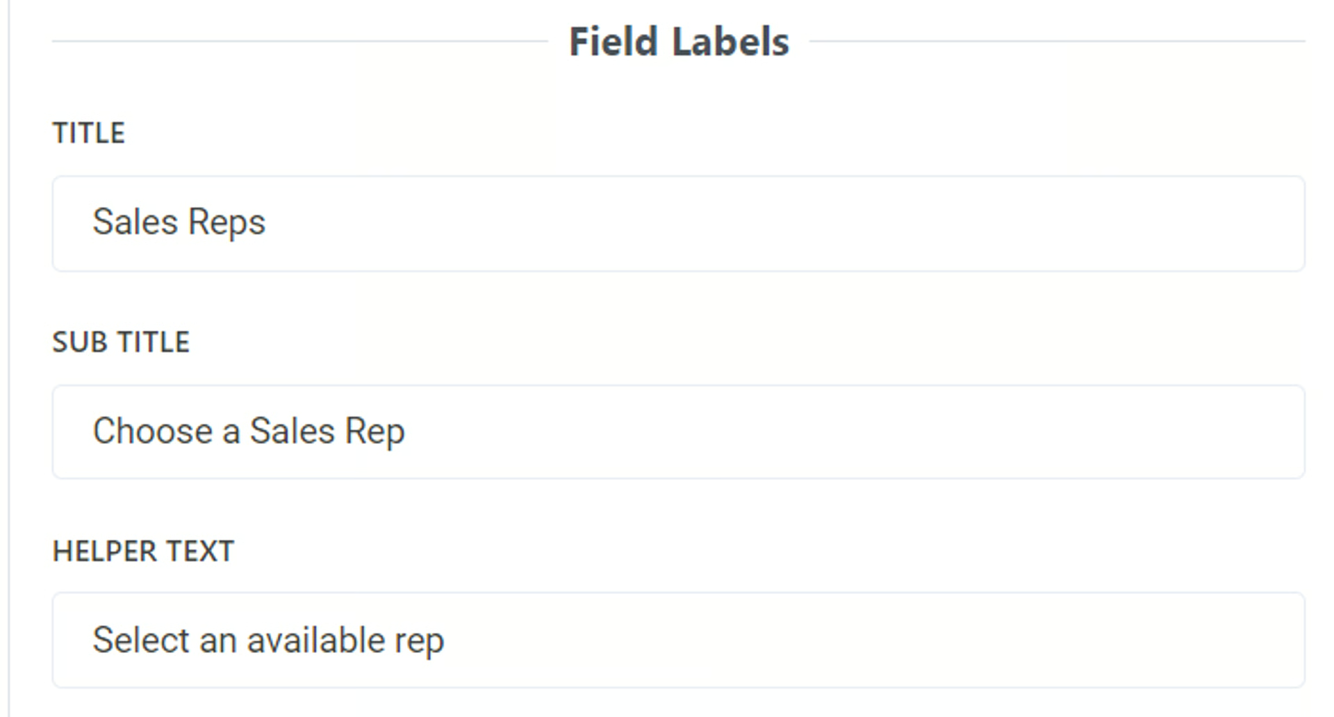
Section titled “Field Configuration”Field Labels
Section titled “Field Labels”Title
- Add a title to be displayed above the field as the main name. To leave blank, add a single space
By default, this is the name of your field in Airtable. You can use a different field name than your base and it will not affect the field name in your base.
Sub Title
- Add a subtitle to be displayed above the field. To leave blank, add a single space
You can use text in this field and you can use Markdown to increase text size, bold, or italics
Related:  Use Markdown with On2Air Forms
Helper Text
- Add helper text to be displayed below the field. To leave blank, add a single space
You can use text in this field and you can use Markdown to increase text size, bold, or italics
Related: Use Markdown with On2Air Forms
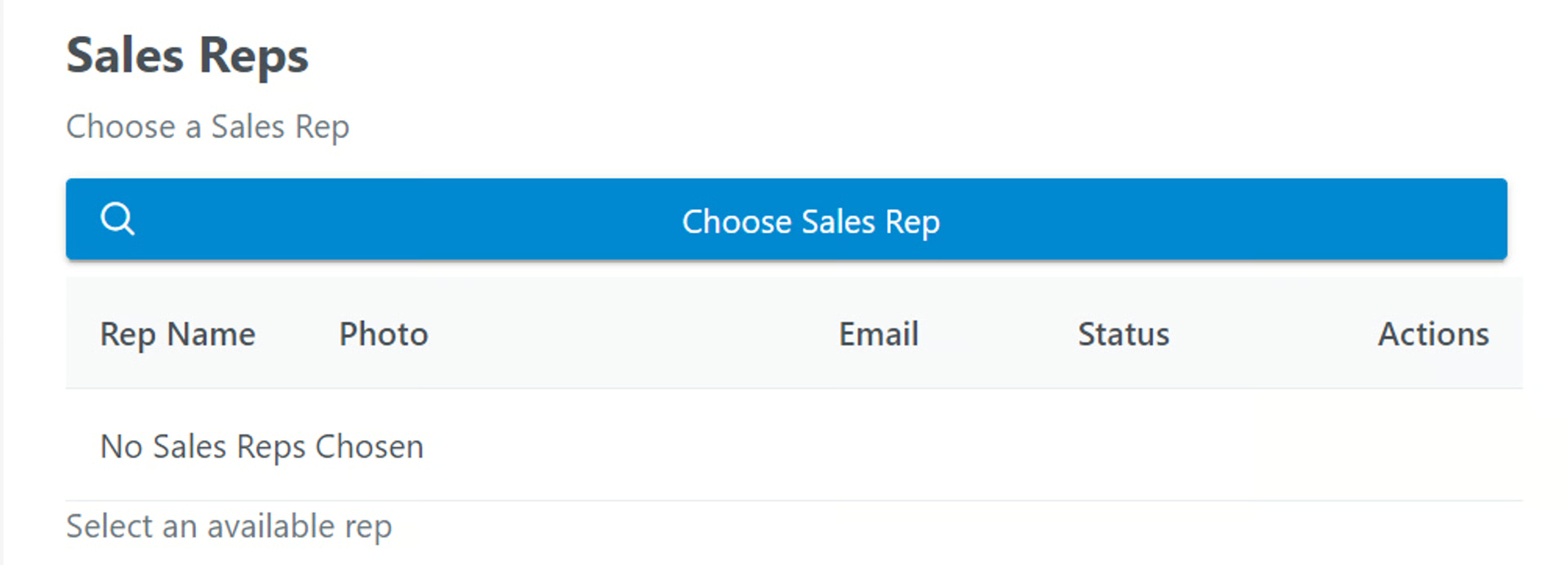
Example:
Field Status
Section titled “Field Status”- Optional Field - Determine how to this field is displayed. Standard Editable Field, but not required.
- Required Field - Determine how to this field is displayed. Standard Editable Field that is required.
- Disabled Field - Determine how to this field is displayed. Standard Field as Non-Editable.
- Display Field Content - Determine how to this field is displayed. Display Field as Text or other Displayable format (not editable).
- Hidden Field - Determine how to this field is displayed. Field is Included but not Visible.
Default Value - Add a default value to this field that will be added to every form submission
Use Default on Edit if Empty - Enable if you want to use the default value on Record Edits if the field has no value when the form is submitted
➡️
Related:  How to Add Default Values to Your Form
URL Prefill Settings
Section titled “URL Prefill Settings”URL Prefill Key
Section titled “URL Prefill Key”The Key used to set this field value from the URL (i.e. ?key=value). (i.e. www.yoururl.com?key=value)
Remove key to disable URL Prefills for this field.
Example: Your URL is www.yoururl.com?shoes=red
- The Key is shoes and the value is red. When your form user uses this URL, the shoes field will automatically be entered as red without the user having to enter it in.
➡️
Related:  What is a URL Prefill (Pre-Populated Fields) and How to Use Them in On2Air Forms
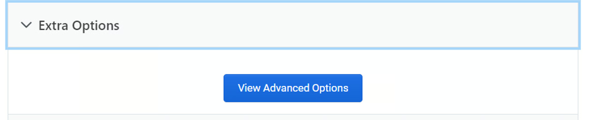
Extra Options (Advanced)
Section titled “Extra Options (Advanced)”You can format numbers in various ways.
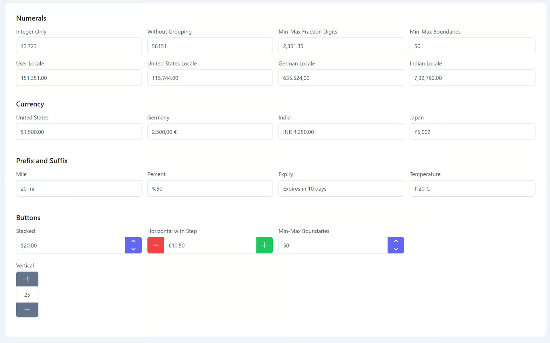
Number Properties
Section titled “Number Properties”You can add additional options to your Number field with the following properties
- Open the Extra Options menu in your field and click View Advanced Options
Name
Description
ariaLabelledBy
Establishes relationships between the component and label(s) where its value should be one or more element IDs.
tooltipOptions
Configuration of the tooltip, refer to the tooltip documentation for more information.
tooltip
Content of the tooltip.
inputClassName
Inline style of the input field.
inputStyle
Inline style of the input field.
inputId
Identifier of the input element.
className
Style class of the element.
style
Inline style of the component.
size
Size of the input field.
readOnly
When present, it specifies that the element should be read-only. Default is false
placeholder
Hint text for the input field.
inputmode
The inputmode attribute provides a hint to browsers for devices with onscreen keyboards to help them decide which keyboard to display.
pattern
The pattern attribute specifies a regular expression that the element’s value is checked against on form submission.
autoFocus
When present, it specifies that the component should automatically get focus on load.
tabIndex
Index of the element in tabbing order.
required
When present, it specifies that an input field must be filled out before submitting the form.
disabled
When present, it specifies that the element should be disabled.
max
Maximum boundary value.
min
Mininum boundary value.
step
Step factor to increment/decrement the value. Default is 1
allowEmpty
Determines whether the input field is empty.
type
Type of the input element.
name
Name of the input element.
id
Identifier of the element.
maxFractionDigits
The maximum number of fraction digits to use. Possible values are from 0 to 20; the default for plain number formatting is the larger of minimumFractionDigits and 3; the default for currency formatting is the larger of minimumFractionDigits and the number of minor unit digits provided by the ISO 4217 currency code list(2 if the list doesn’t provide that information).
minFractionDigits
The minimum number of fraction digits to use. Possible values are from 0 to 20; the default for plain number and percent formatting is 0; the default for currency formatting is the number of minor unit digits provided by the ISO 4217 currency code list (2 if the list doesn’t provide that information).
useGrouping
Whether to use grouping separators, such as thousands separators or thousand/lakh/crore separators.
currencyDisplay
How to display the currency in currency formatting. Possible values are “symbol” to use a localized currency symbol such as €, ü”code” to use the ISO currency code, “name” to use a localized currency name such as “dollar”; the default is “symbol”.
currency
The currency to use in currency formatting. Possible values are the ISO 4217 currency codes, such as “USD” for the US dollar, “EUR” for the euro, or “CNY” for the Chinese RMB. There is no default value; if the style is “currency”, the currency property must be provided.
suffix
Text to display after the value.
prefix
Text to display before the value.
mode
Defines the behavior of the component, valid values are “decimal” and “currency”.
localeMatcher
The locale matching algorithm to use. Possible values are “lookup” and “best fit”; the default is “best fit”. See Locale Negotation for details.
locale
Locale to be used in formatting.
decrementButtonIcon
Style class of the decrement button.
incrementButtonIcon
Style class of the increment button.
decrementButtonClassName
Style class of the decrement button.
incrementButtonClassName
Style class of the increment button.
buttonLayout
Layout of the buttons, valid values are “stacked” (default), “horizontal” and “vertical”.
showButtons
Displays spinner buttons.
format
Whether to format the value.
value
Value of the component.
See more details - Prime React Input Numbers
Remove Commas from Numbers
Section titled “Remove Commas from Numbers”If your number needs no commas, uncheck the useGrouping option
Danger Zone
Section titled “Danger Zone”- Delete your field from the form
- Click Remove
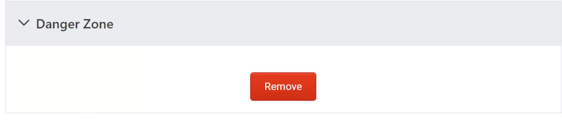
- Click Yes, I want to delete this field from the form