Style Your Forms and Fields - CSS Class Styling
🔴 On2Air Forms has been shutdown to focus on our On2Air Backups Airtable app Learn more about automated Airtable backups - on2air.com
You can use these styling options to further style your fields in the Extra Options setting, such as the Submission and Linked Record buttons, Button Field, and On2Air Formula fields. You can choose options such as text color, text size, background color, alignment, and more.
💡
Related:  Build a Dashboard using Airtable Data with On2Air Forms
In this tutorial
-
How to add Styles - On2Air Formula
-
How to add Styles - Submit Button, Linked Record Button, and Other Field Types
-
Typography
-
Font Size
-
Font Weight
-
Font Style
-
Text Color
-
Text Align
-
Text Decoration
-
Text Transform (Case)
-
Line Height
-
List Style
-
Background
-
Background Color
-
Border
-
Border Radius
-
Border Width
-
Border Style
-
Border Color
-
Spacing
-
Padding
-
Margin
-
Other
-
Elevation (Shadow)
-
Transition
-
Animation
-
Transform
-
Interactivity
-
See all Available Styling Options
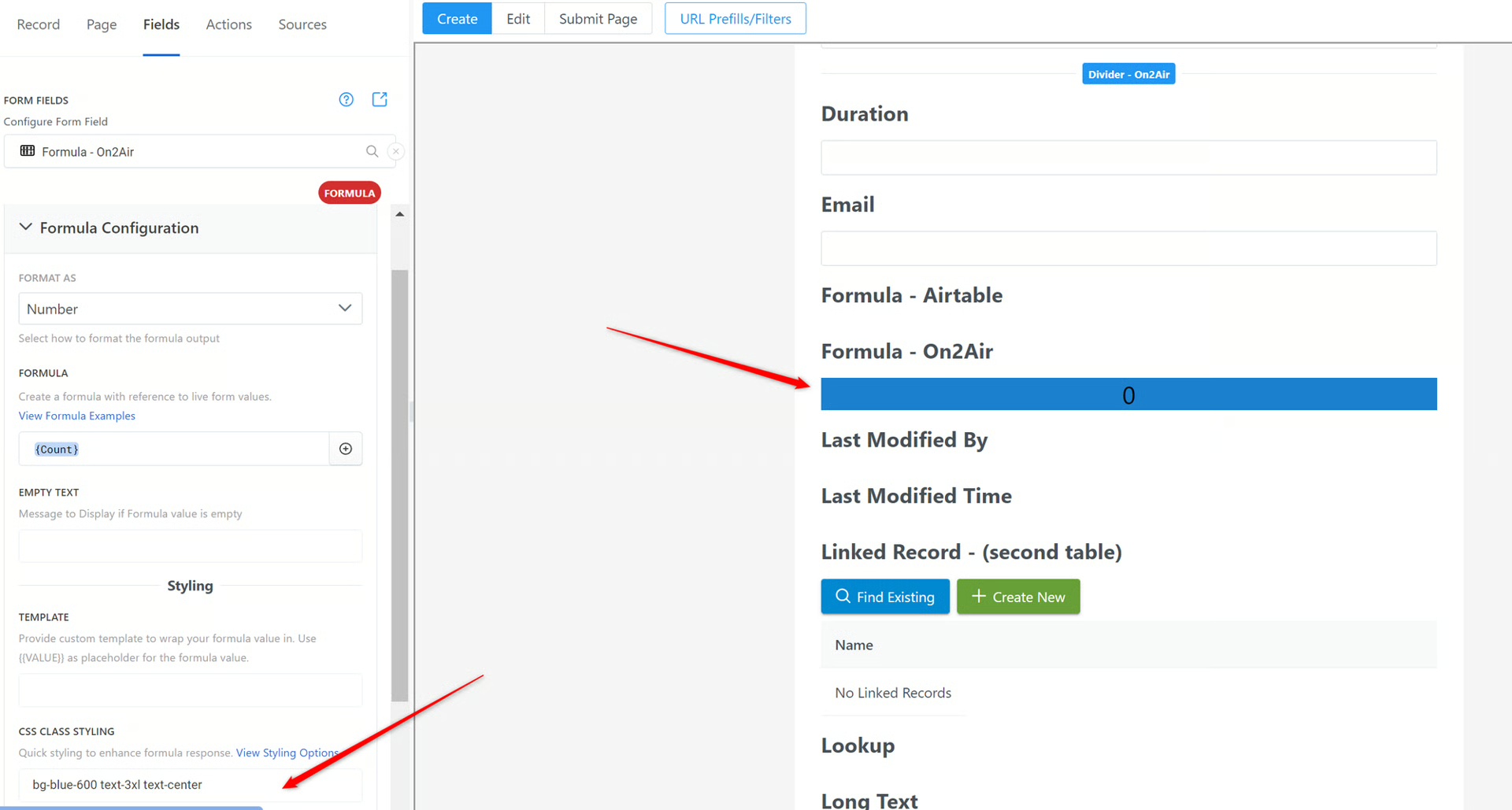
How to add Styles - On2Air Formula
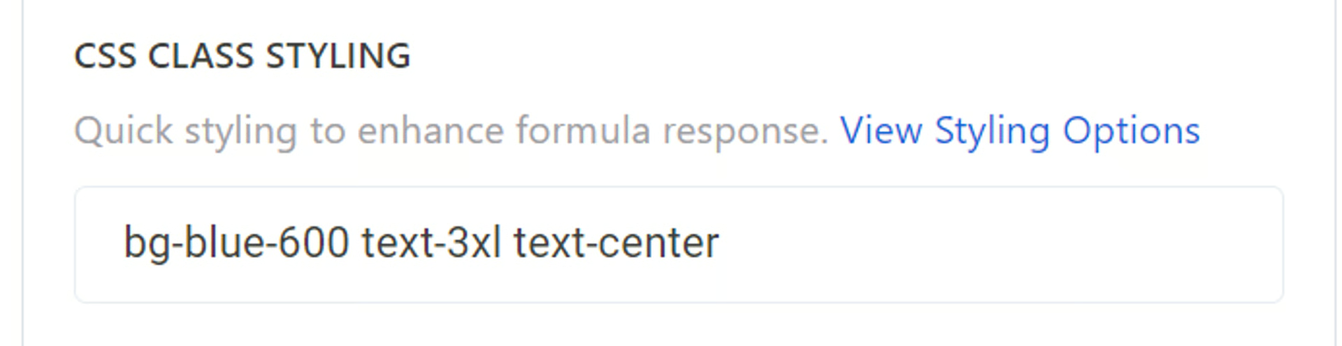
Section titled “How to add Styles - On2Air Formula”In the On2Air Formula field, add the style option class name for the style you want in the CSS Class Styling.
Class names are basic text and number classes. All you need to do is find the styles you want and type it in.
To add multiple styles, add a space between the class names.
In this example: bg-blue-300 adds a blue background, text-3xl sets the value size to 3xl, and text-center will center align the value.
How to add Styles - Submit Button, Linked Record Button, and Other Field Types
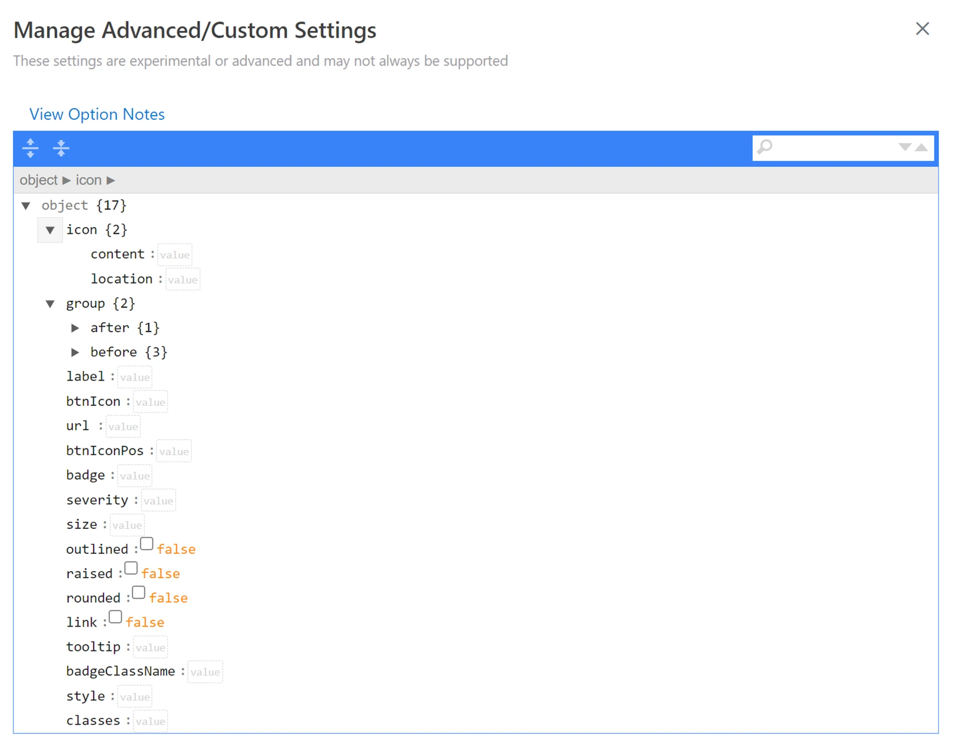
Section titled “How to add Styles - Submit Button, Linked Record Button, and Other Field Types”In other Field Types, open the Extra Options menu > View Advanced Options
Note: not all field types support custom options
- You’ll see a page similar to the one below
- Enter any CSS class name in the classes field
Typography
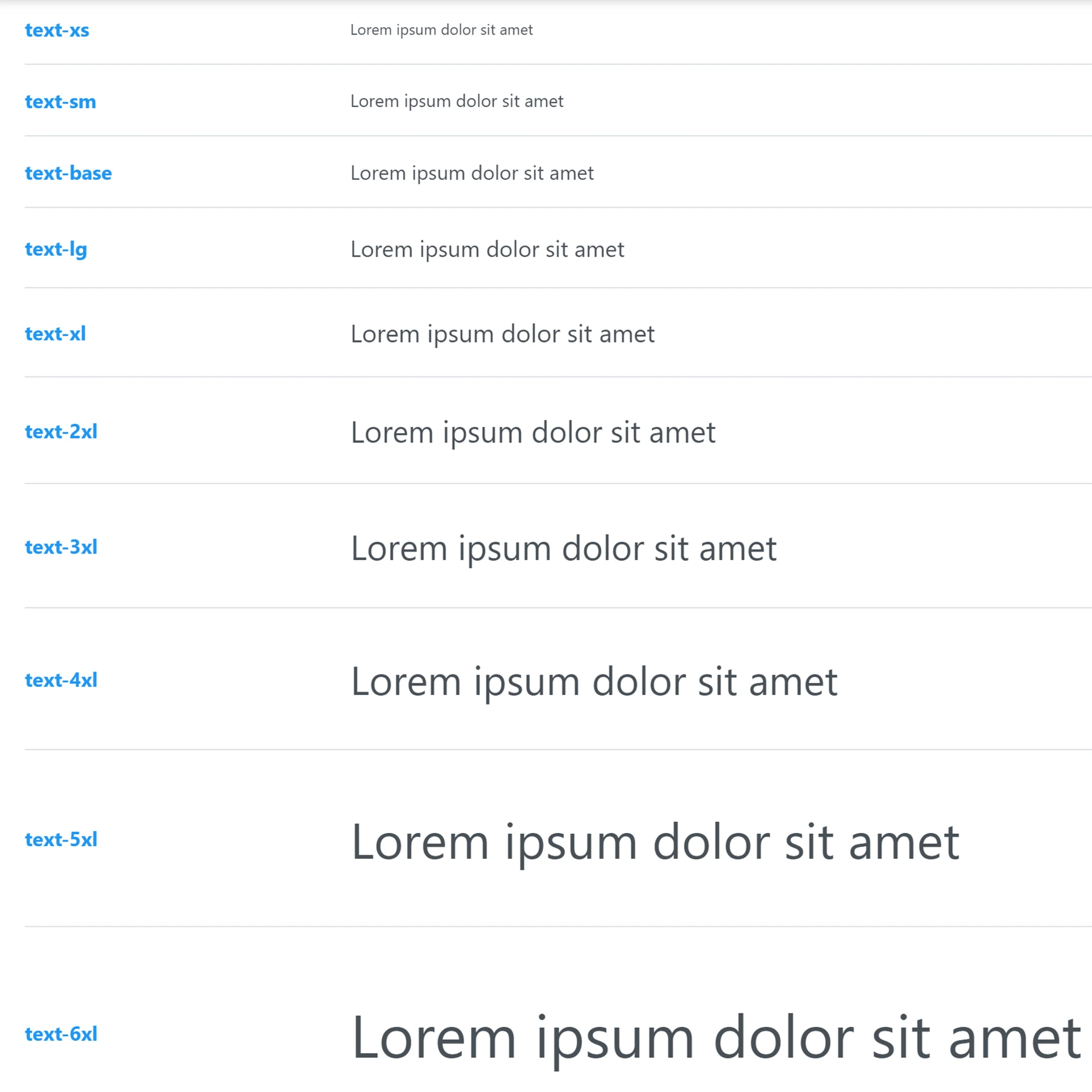
Section titled “Typography”Font Size
Section titled “Font Size”Class
Font Weight
Section titled “Font Weight”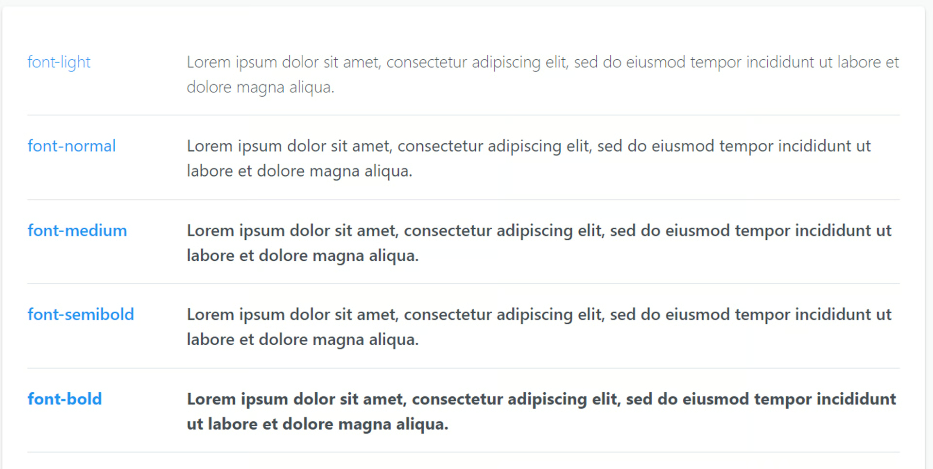
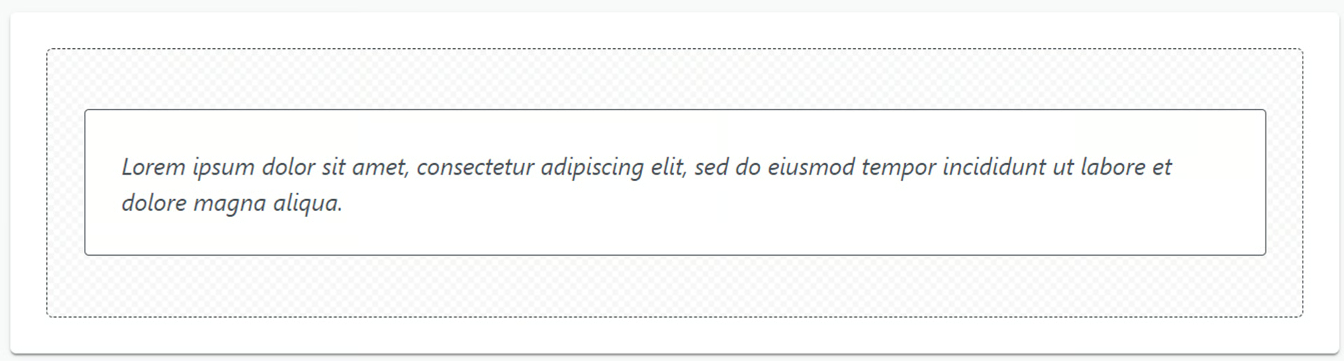
Font Style
Section titled “Font Style”font-italic
Text Color
Section titled “Text Color”Click the link below to see all available colors and their class
PrimeFlex
Section titled “PrimeFlex”Defines the color of the text inside of an element. Classes Colors are derived from the Prime UI library theme being used via css properties. Examples text-500 text-cyan-500 text-orange-500 Pseudo States Focus, Hover and Active states are available with the focus:, hover:, active: prefixes respectively. hover:text-700 hover:text-cyan-700 hover:text-orange-700

Text Align
Section titled “Text Align”Class
text-center
text-justify
text-left
text-right
Text Decoration
Section titled “Text Decoration”Class
underline
line-through
no-underline
Text Transform (Case)
Section titled “Text Transform (Case)”Class
lowercase
uppercase
capitalize
Line Height
Section titled “Line Height”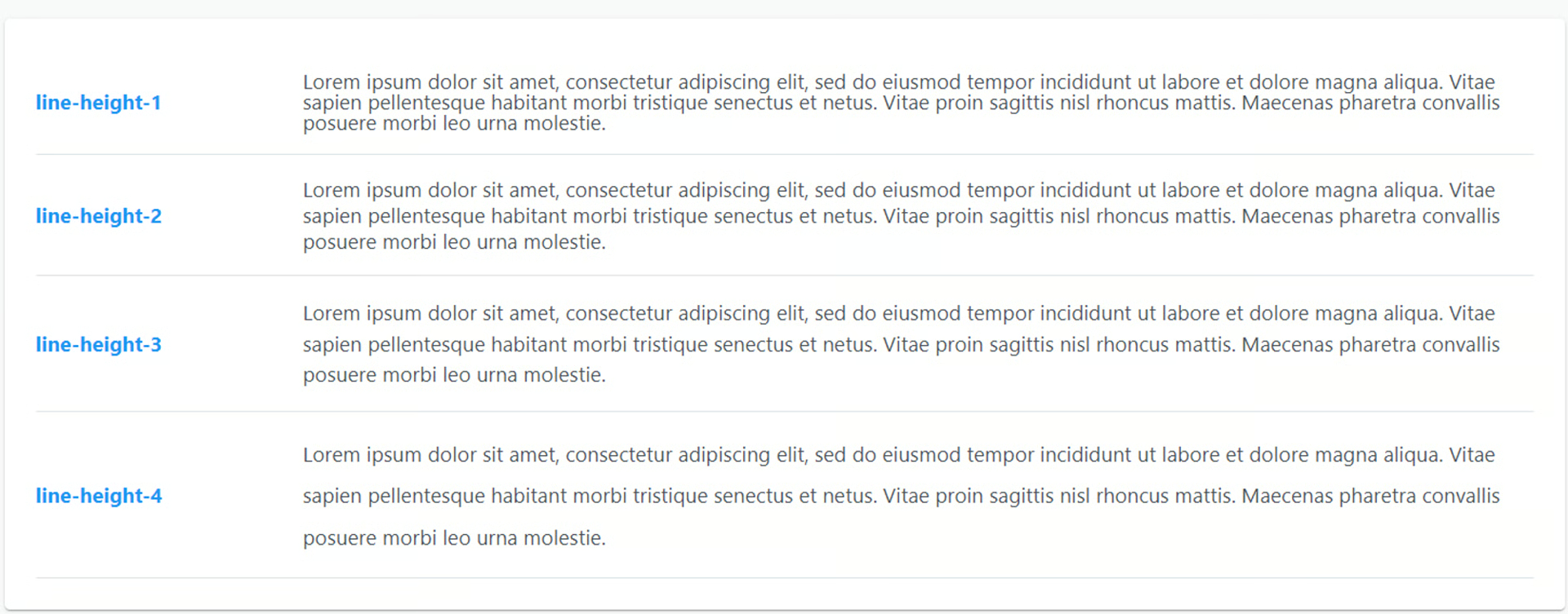
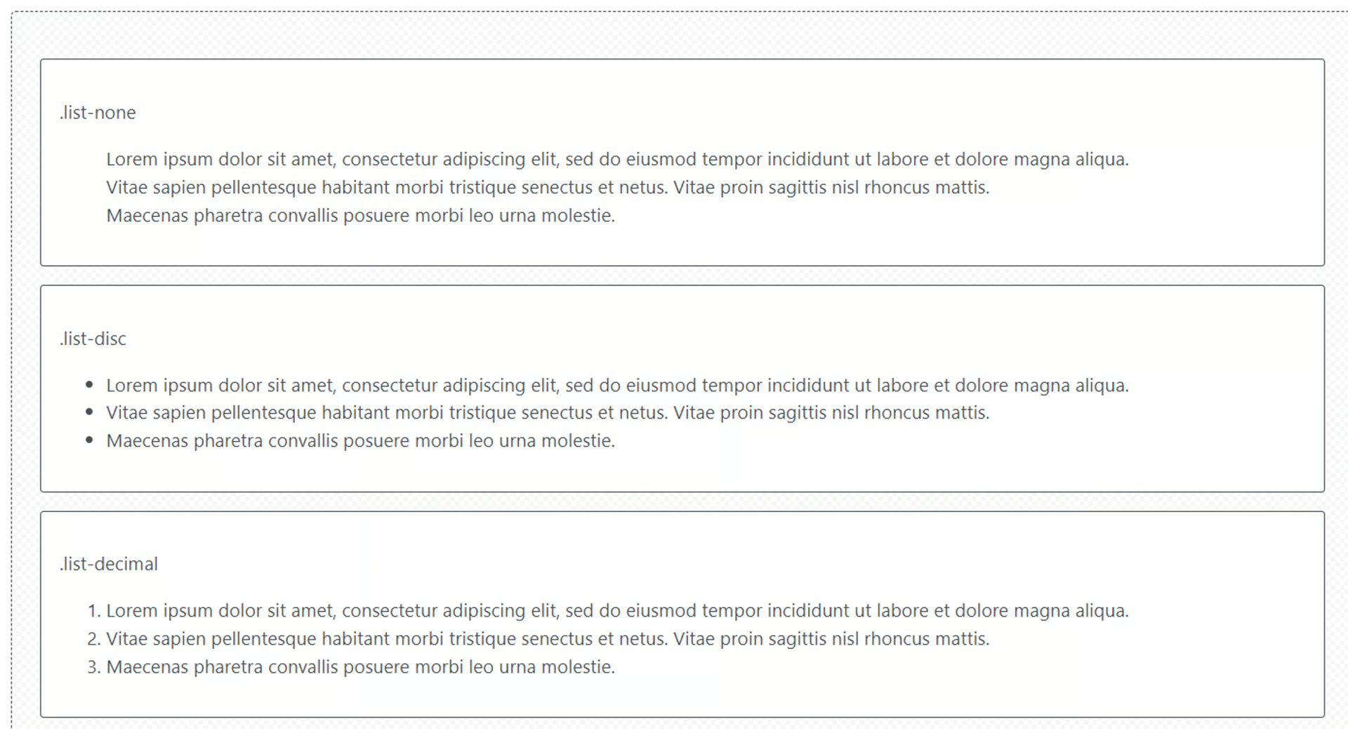
List Style
Section titled “List Style”Class
list-none
list-disc
list-decimal
Background
Section titled “Background”Background Color
Section titled “Background Color”To add a background color to your formula field, choose from the list of colors at the link below and enter the Class in the formula CSS Class Styling field.
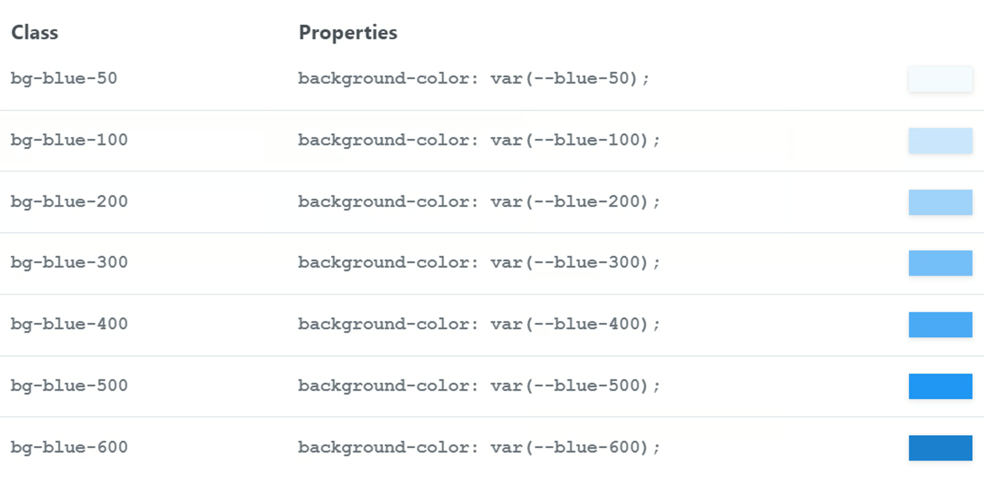
Click the link below to see a full list of available colors
PrimeFlex
Section titled “PrimeFlex”Choose from a variety of colors for the background of an element. Classes Colors are derived from the Prime UI library theme being used via css properties. bg-primary background-color: var(—primary-color); color: var(—primary-color-text); bg-primary-reverse background-color: var(—primary-color-text); color: var(—primary-color); Examples surface-500 bg-cyan-500 bg-orange-500 Pseudo States Focus, Hover and Active states are available with the focus:, hover:, active: prefixes respectively.
Border
Section titled “Border”Border Radius
Section titled “Border Radius”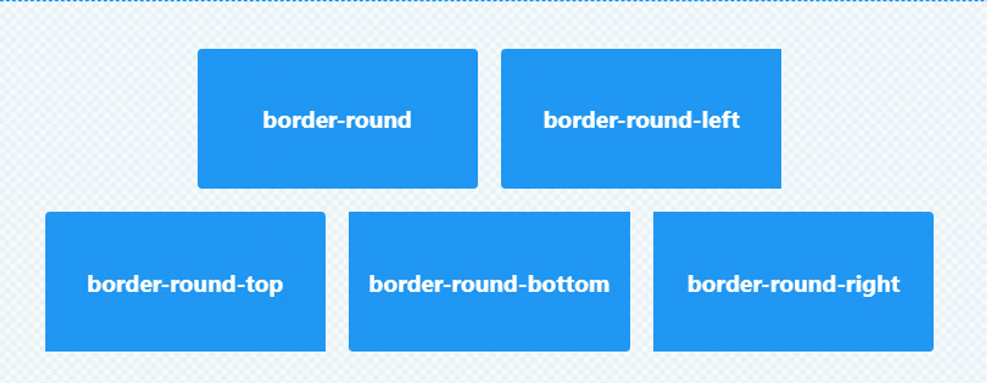
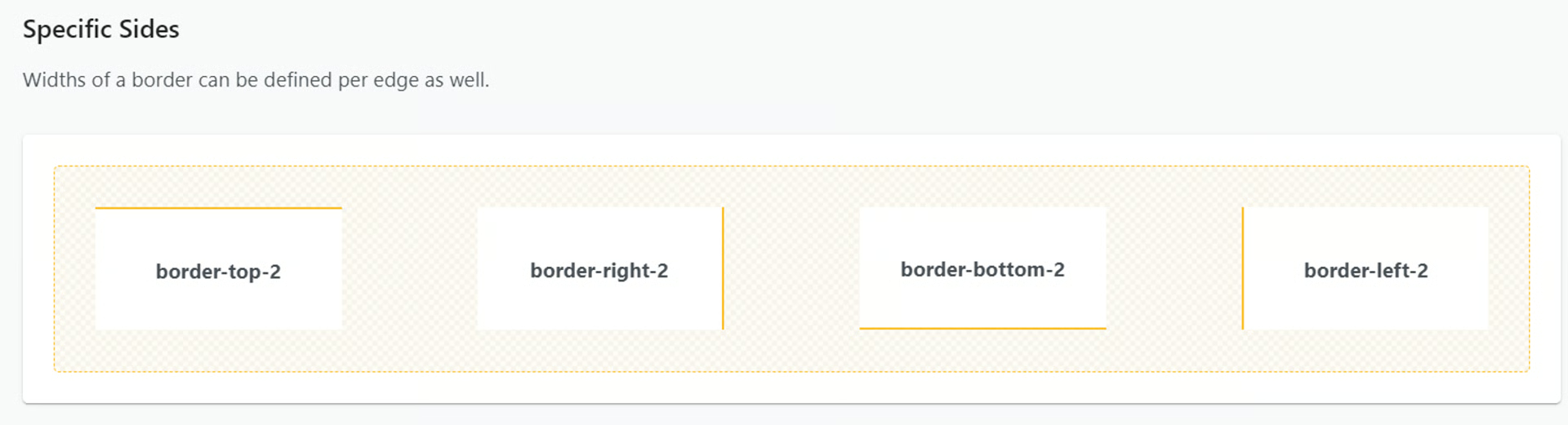
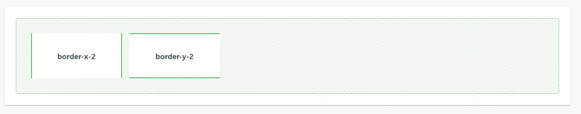
Border Width
Section titled “Border Width”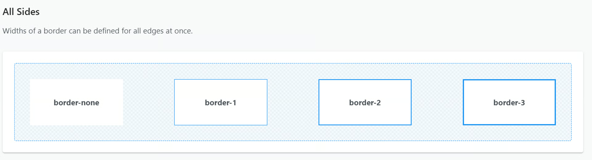
Border Style
Section titled “Border Style”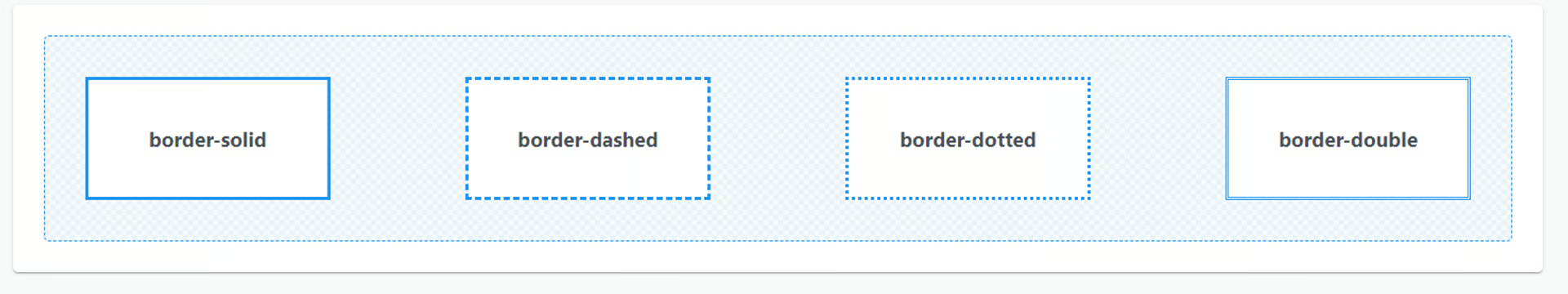
Border Color
Section titled “Border Color”To add a border color to your formula field, choose from the list of colors at the link below and enter the Class in the formula CSS Class Styling field.
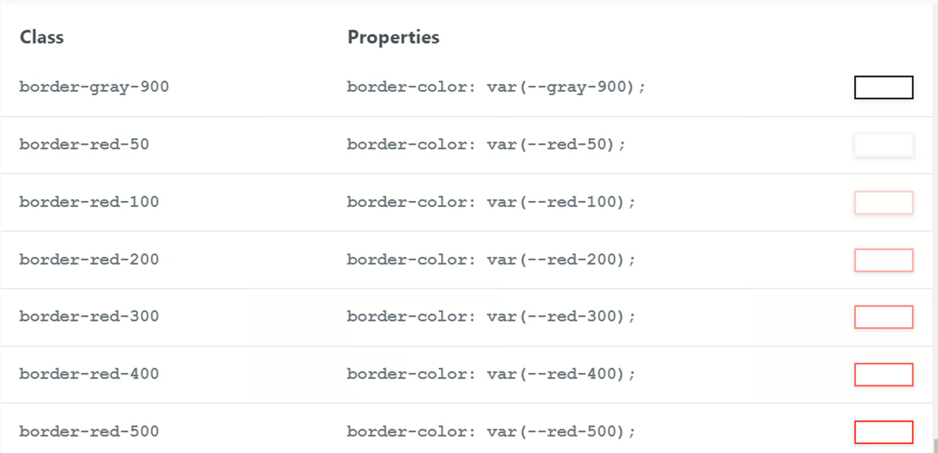
Click the link below to see a full list of available colors
PrimeFlex
Section titled “PrimeFlex”A wide range of color palettes for the border of an element.
Spacing
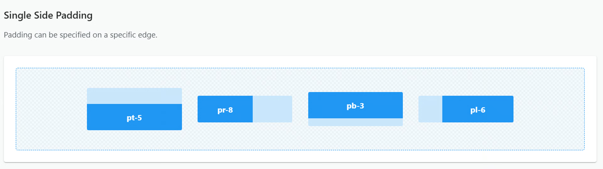
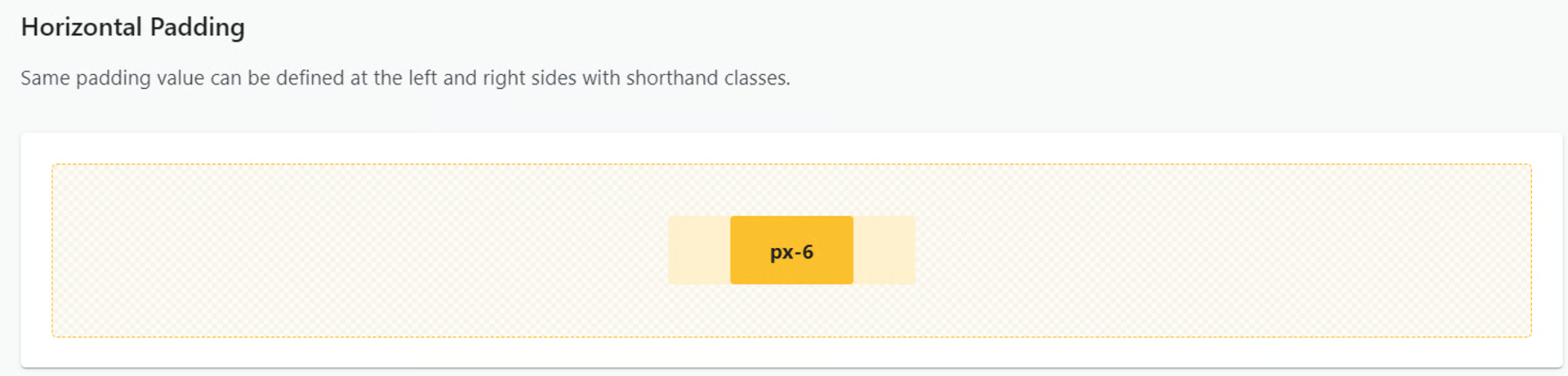
Section titled “Spacing”Padding
Section titled “Padding”Click below to see all available padding options
PrimeFlex
Section titled “PrimeFlex”Specifies the space between the content and its border. Classes Single Side Padding Padding can be specified on a specific edge. pt-5 pr-8 pb-3 pl-6 Horizontal Padding Same padding value can be defined at the left and right sides with shorthand classes.
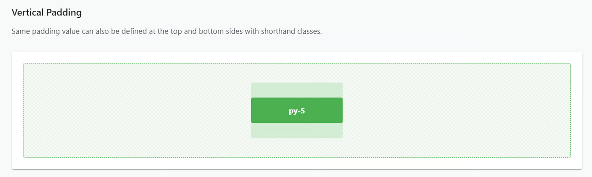
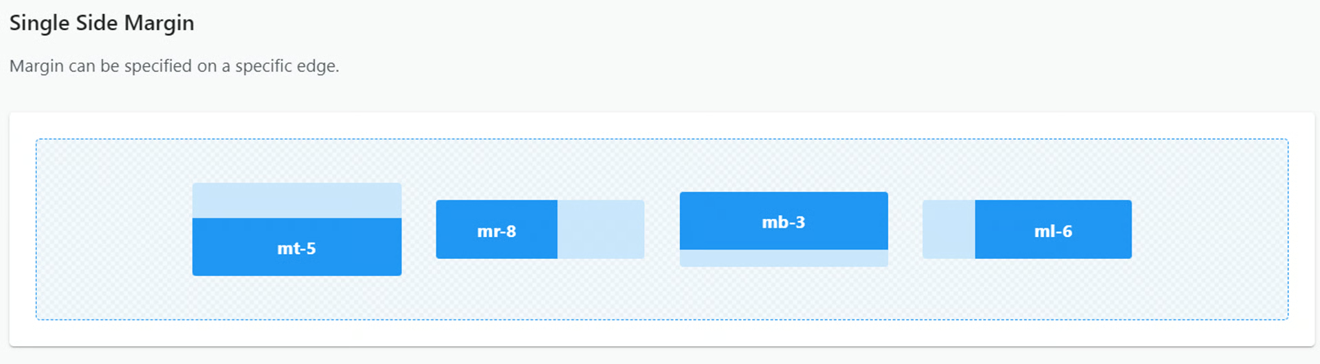
Margin
Section titled “Margin”Click below to see all available margin options
PrimeFlex
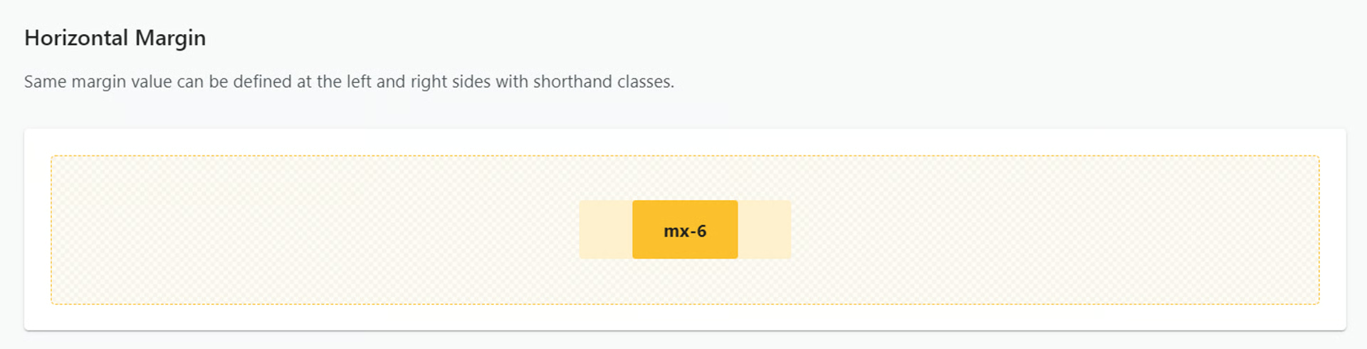
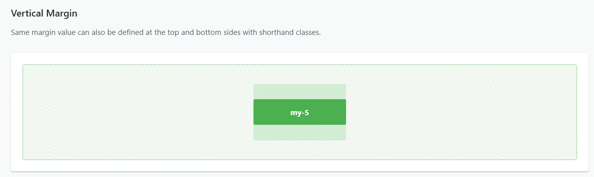
Section titled “PrimeFlex”Controls the space around an element. Classes Single Side Margin Margin can be specified on a specific edge. mt-5 mr-8 mb-3 ml-6 Horizontal Margin Same margin value can be defined at the left and right sides with shorthand classes. Vertical Margin Same margin value can also be defined at the top and bottom sides with shorthand classes.
Elevation (Shadow)
Section titled “Elevation (Shadow)”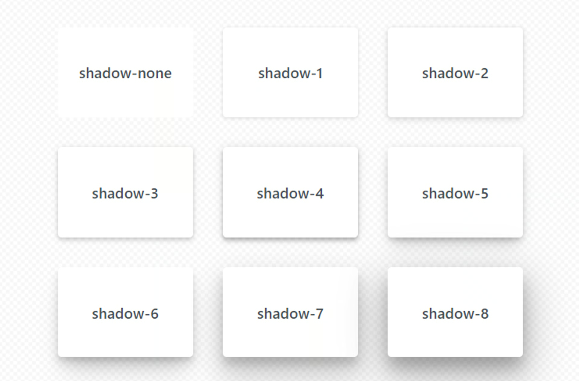
Transition
Section titled “Transition”PrimeFlex
Section titled “PrimeFlex”Specifies the properties to apply transition. Classes transition-none transition-property: none; transition-all transition-property: all; transition-colors transition-property: background-color,border-color,color; transition-transform transition-property: transform; Examples Hover me
Animation
Section titled “Animation”PrimeFlex
Section titled “PrimeFlex”fadein animation: fadein .15s linear; @keyframes fadein { 0% { opacity: 0; } 100% { opacity: 1; } } fadeout animation: fadeout .15s linear; @keyframes fadeout { 0% { opacity: 1; } 100% { opacity: 0; } } slidedown animation: slidedown .45s ease-in-out; @keyframes slidedown { 0% { max-height: 0;
Transform
Section titled “Transform”PrimeFlex
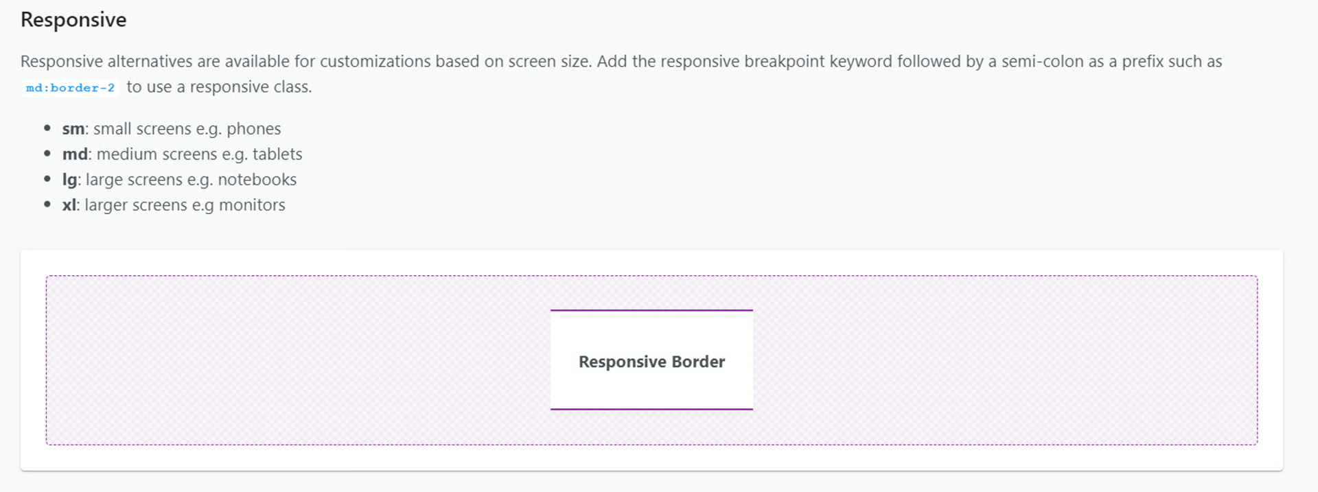
Section titled “PrimeFlex”Moves an element along the x and y axis. Classes Examples Responsive Responsive alternatives are available for customizations based on screen size. Add the responsive breakpoint keyword followed by a semi-colon as a prefix such as md:translate-x-0 to use a responsive class. sm: small screens e.g. phones md: medium screens e.g.