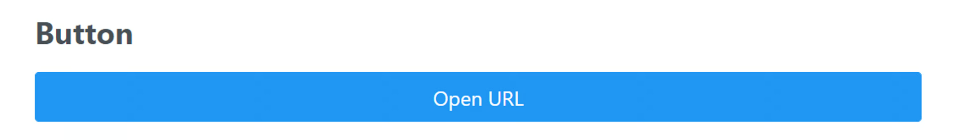
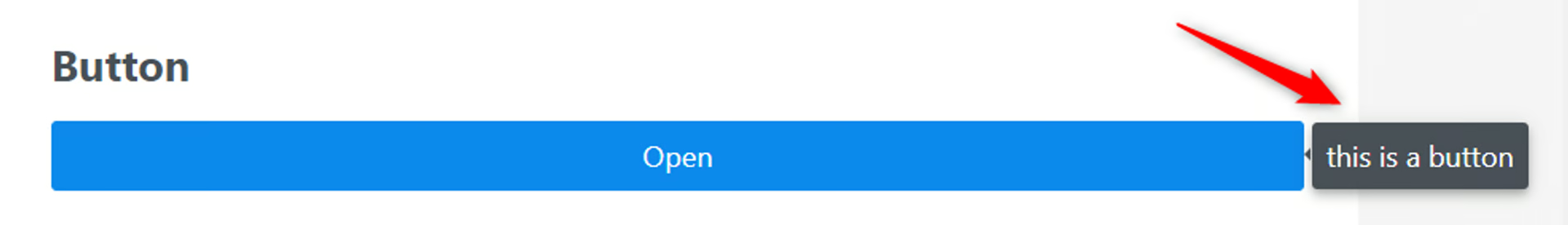
Button
🔴 On2Air Forms has been shutdown to focus on our On2Air Backups Airtable app Learn more about automated Airtable backups - on2air.com
➡️
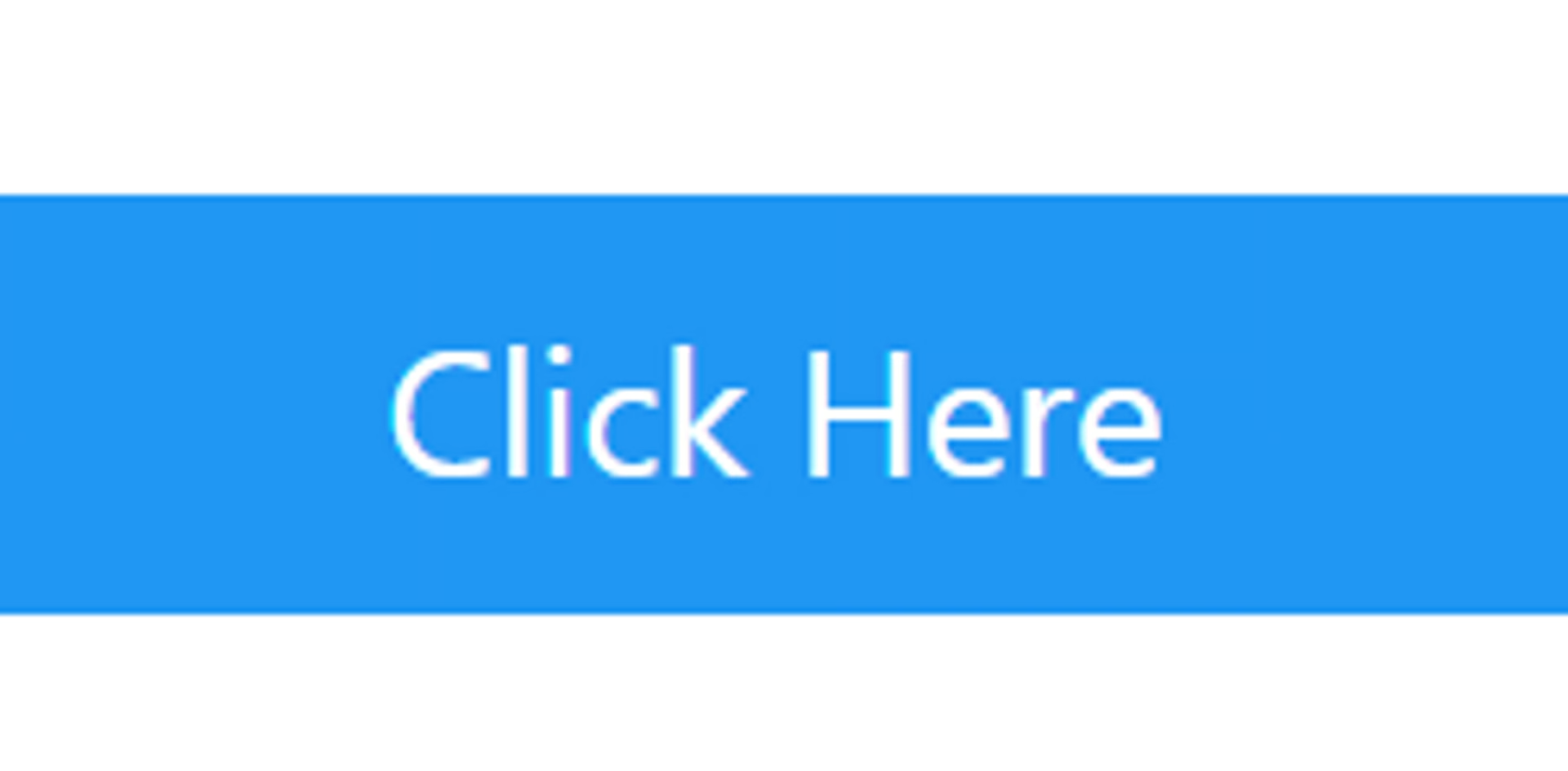
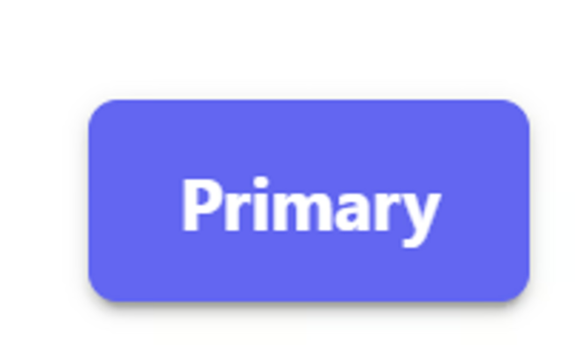
The Button field displays a button that can open any URL from your Airtable base. It can also be used to open static URLs or displayed as a text link.
See more Fields in the Form Field Reference
-
How to Add a Field to Your Form
-
Field Configuration
-
Field Labels
-
Field Status
-
Customize Your Button
-
Color
-
Label
-
Icon
-
Size
-
Severity
-
Outlined
-
Raised (Shadow)
-
Rounded Border
-
URL (Static URL)
-
Link (Turn into Text-only link)
-
Tooltip
-
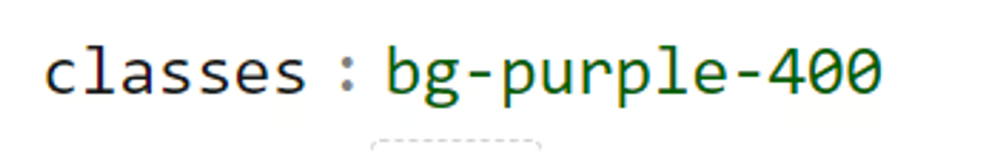
Classes
-
Group
-
Group Button Icon
-
Badges
-
Link Open Options
-
Extra Options (Advanced)
-
Danger Zone - Delete Field from Form
NOTE: This field will only Display on the Edit Record mode and will not refresh live with field edits. If live updates needed, use our  Formula - On2Air field instead.
How to Add a Field to Your Form
Section titled “How to Add a Field to Your Form”Here’s how to add Airtable Fields or On2Air Custom Fields to your Form
➡️
 How to Add Airtable Fields and On2Air Custom Fields to Your Form
Field Configuration
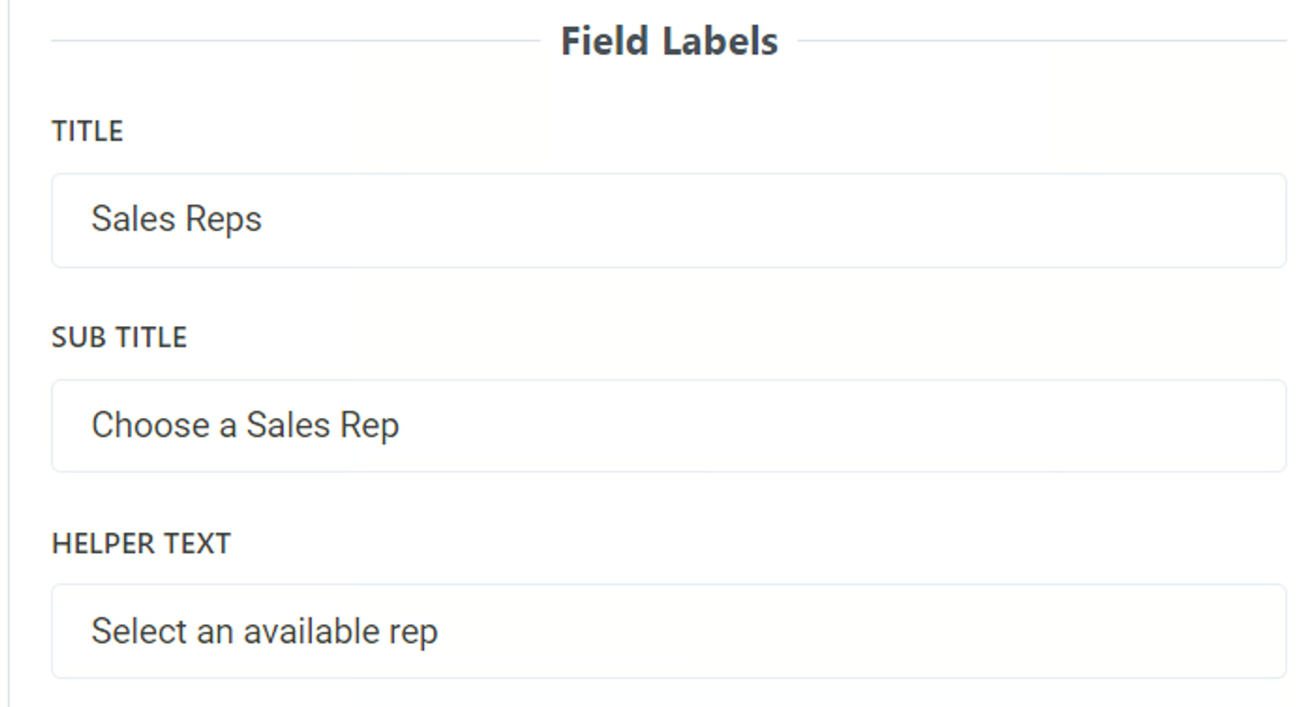
Section titled “Field Configuration”Field Labels
Section titled “Field Labels”Title
- Add a title to be displayed above the field as the main name. To leave blank, add a single space
By default, this is the name of your field in Airtable. You can use a different field name than your base and it will not affect the field name in your base.
Sub Title
- Add a subtitle to be displayed above the field. To leave blank, add a single space
You can use text in this field and you can use Markdown to increase text size, bold, or italics
Related:  Use Markdown with On2Air Forms
Helper Text
- Add helper text to be displayed below the field. To leave blank, add a single space
You can use text in this field and you can use Markdown to increase text size, bold, or italics
Related: Use Markdown with On2Air Forms
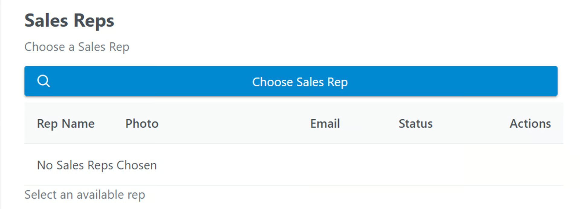
Example:
Field Status
Section titled “Field Status”- Display Field Content - Determine how to this field is displayed. Display Field as Text or other Displayable format (not editable).
- Hidden Field - Determine how to this field is displayed. Field is Included but not Visible.
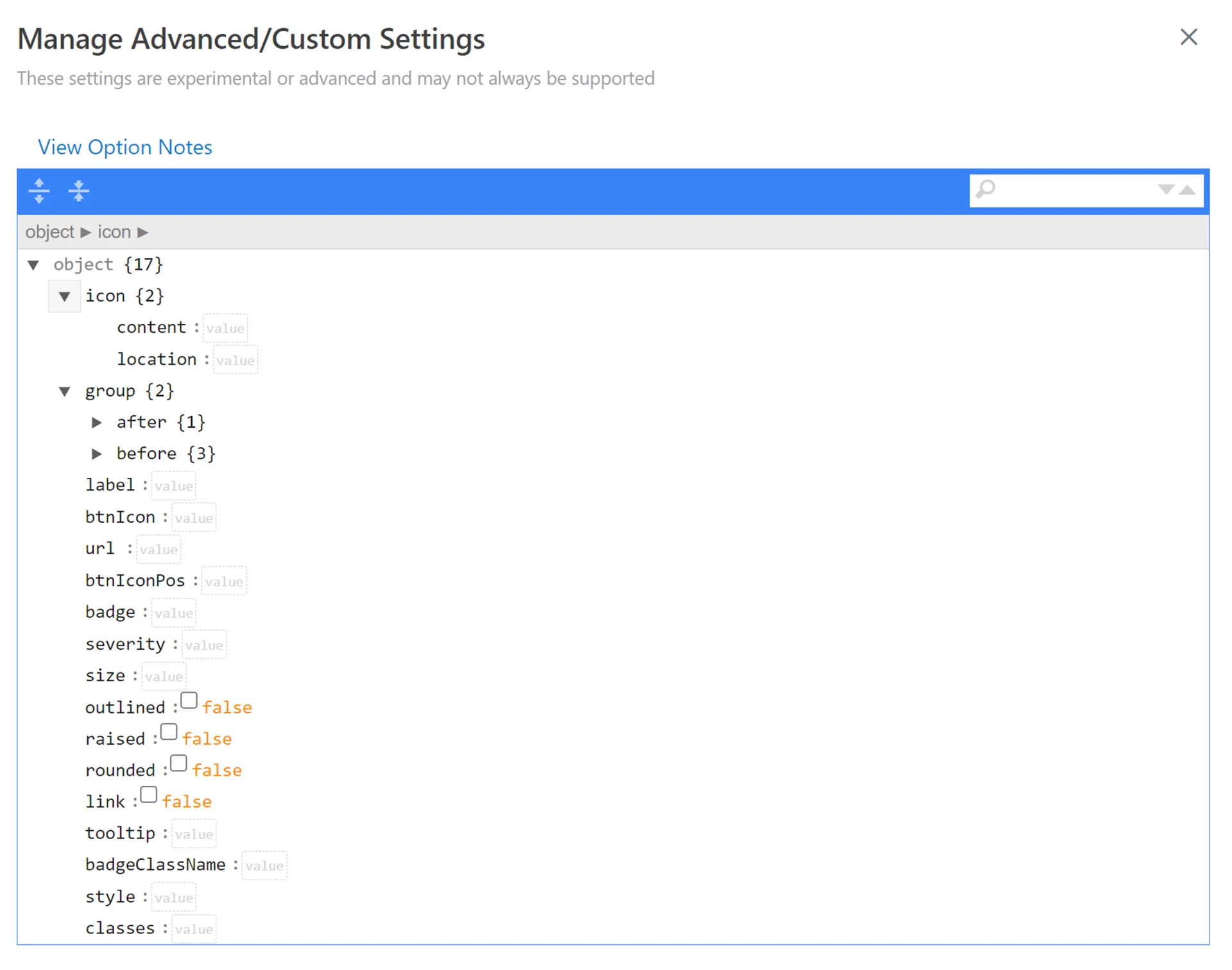
Customize Your Button
Section titled “Customize Your Button”Documentation in Progress
You can customize your button further
- Click Extra Options > View Advanced Options
- You’ll see a list of various settings available to customize - See below for more details
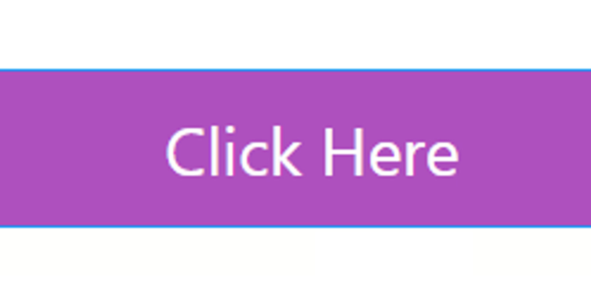
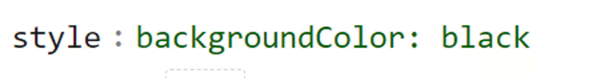
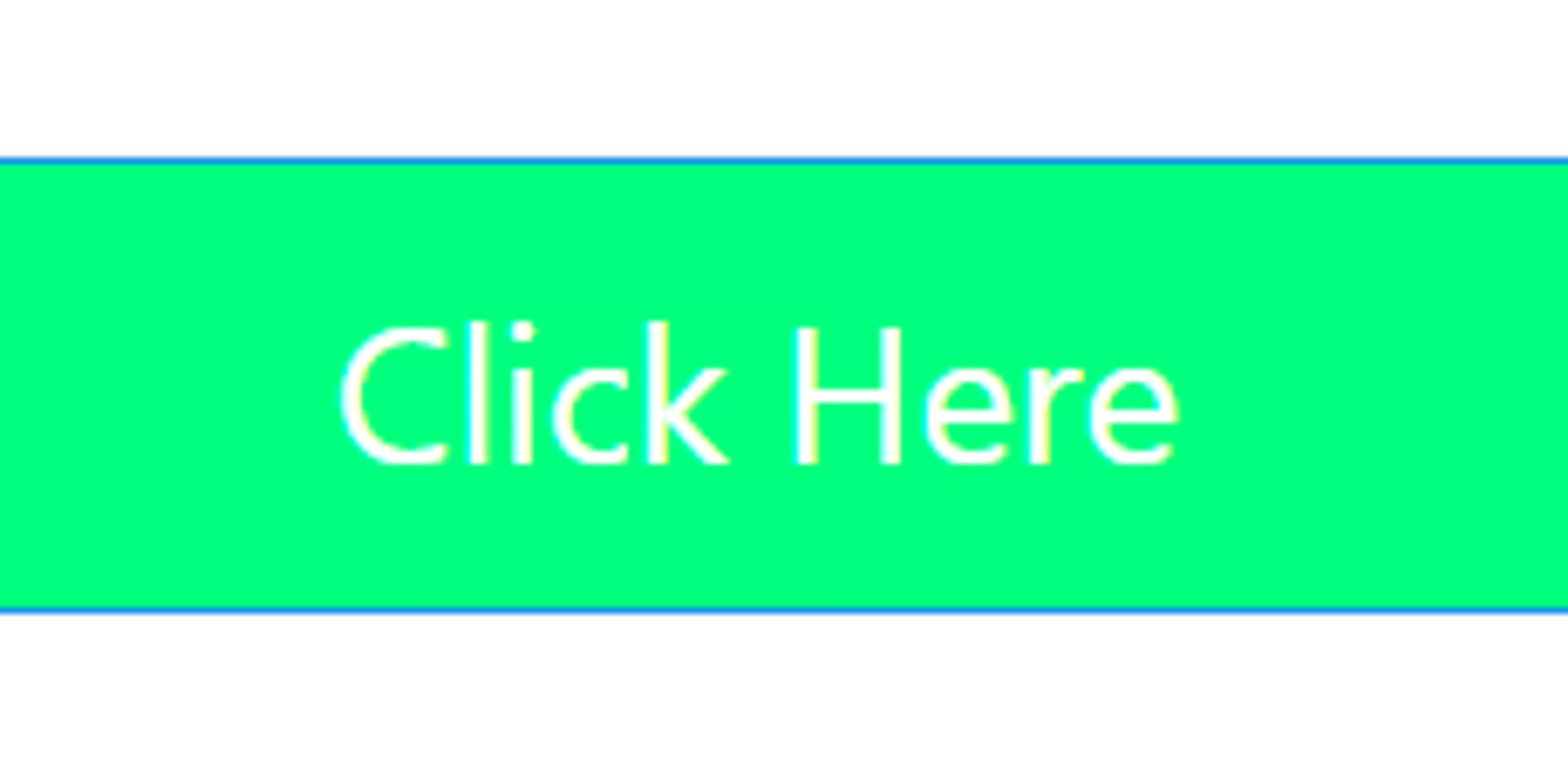
Change the color of your button
There are 2 options to do this -
- In the classes field enter the color you need from this list of colors
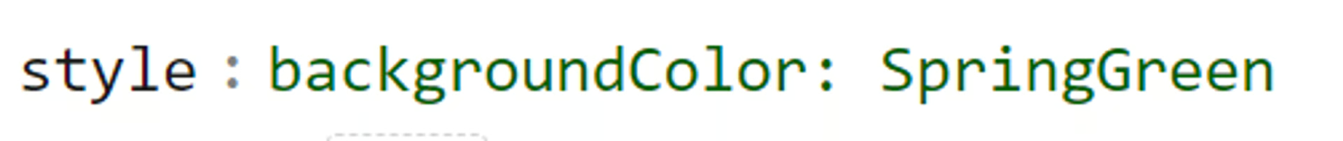
- In the style field, type backgroundColor: color_name
- You can enter in basic color names or you can use any CSS color from this list
Using Color name
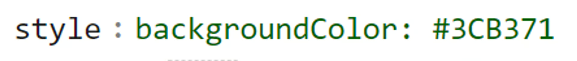
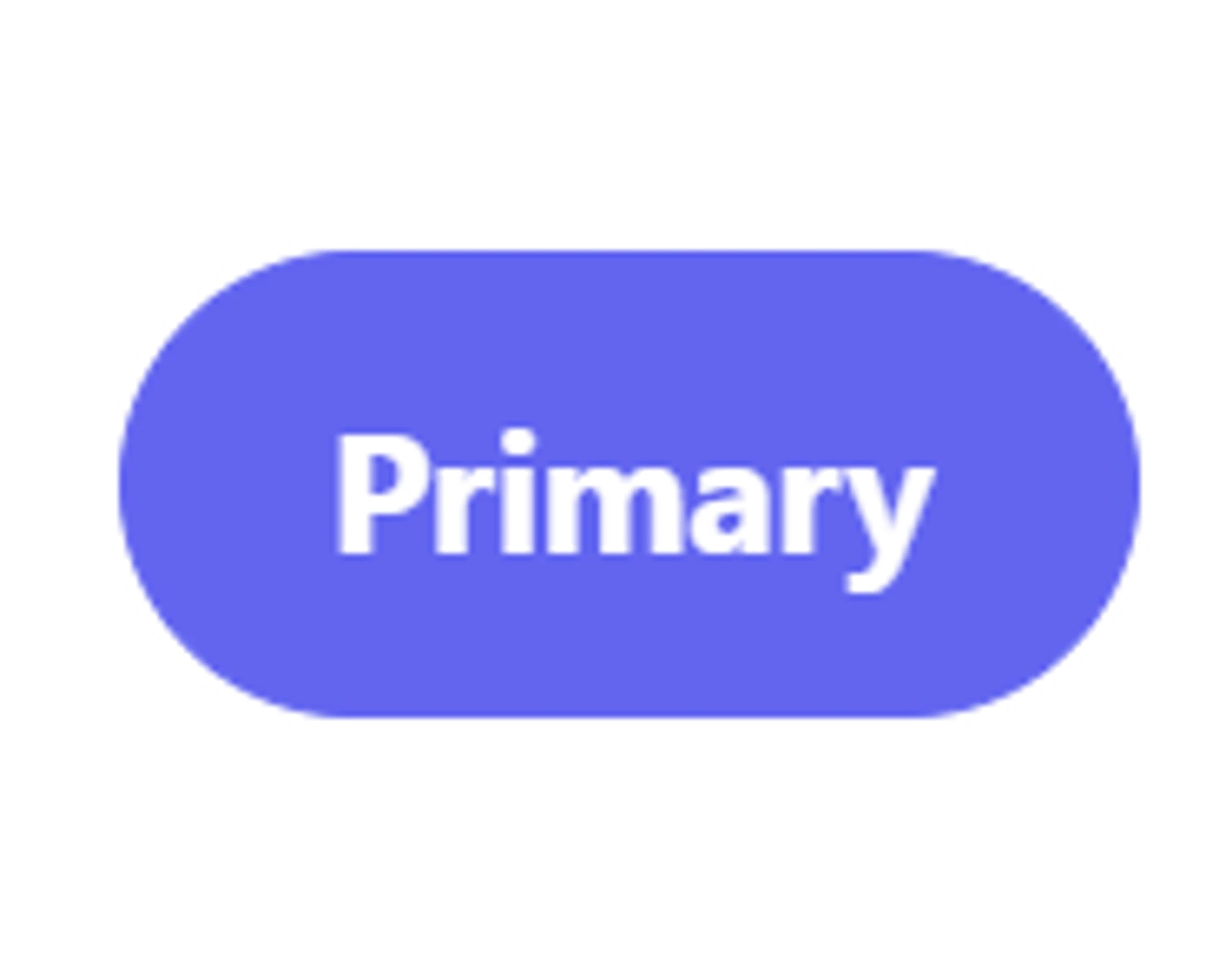
Using CSS color code
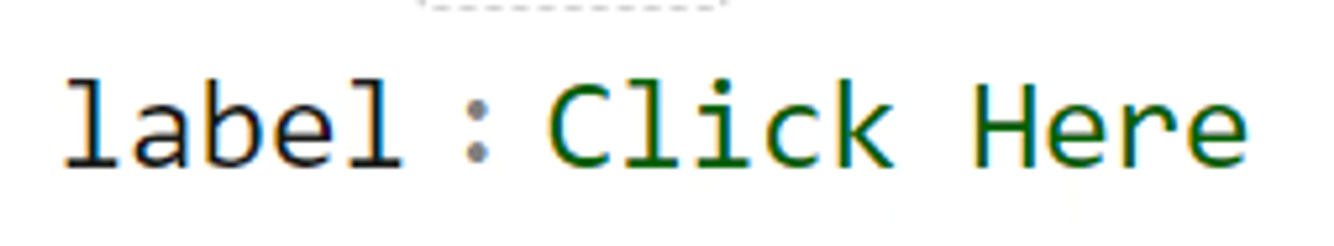
You can change the label on the button in your Airtable base or in On2Air
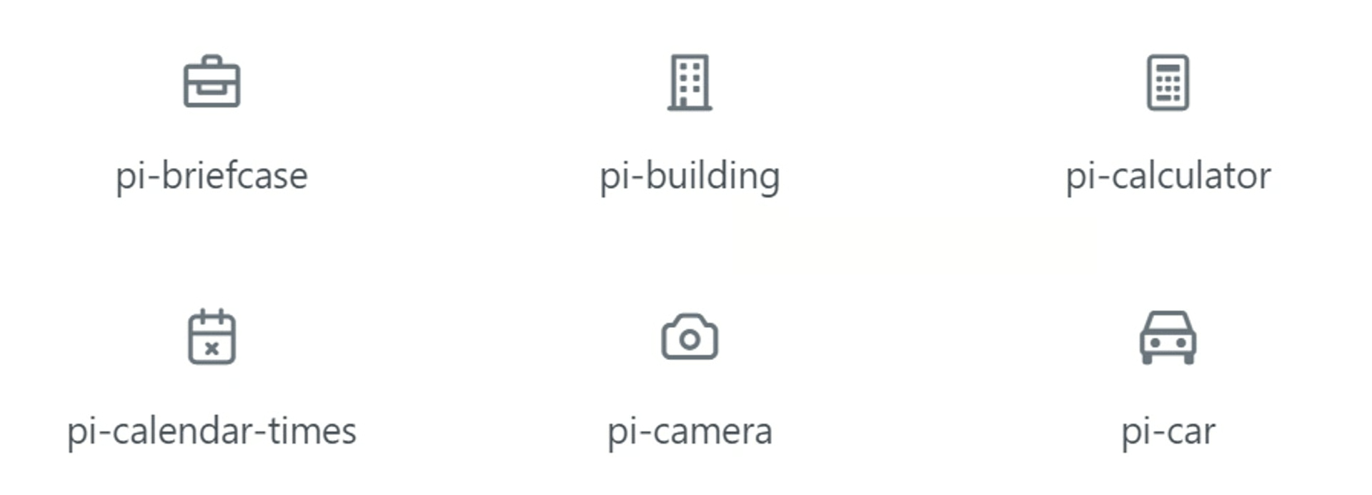
Add an icon to your button - enter in the class name as pi-iconname
Defines the size of the button, valid values are “small” and “large”

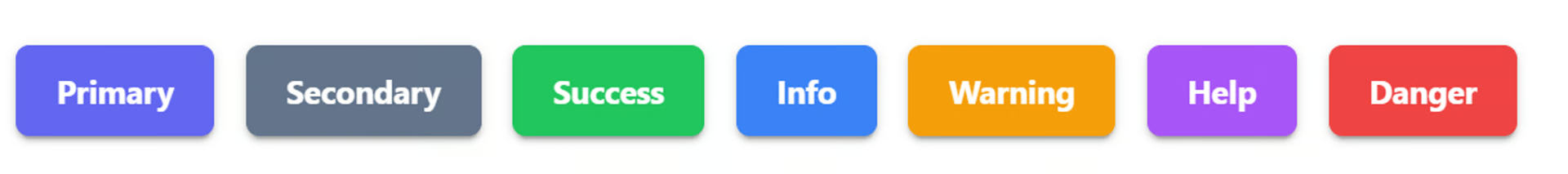
Severity
Section titled “Severity”Defines the style of the button, valid values are “secondary”, “success”, “info”, “warning”, “danger”, “help”
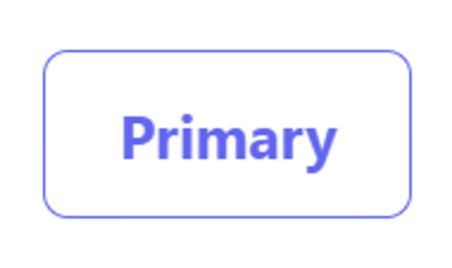
Outlined
Section titled “Outlined”Add a border class without a background initially
Raised (Shadow)
Section titled “Raised (Shadow)”Add a shadow to indicat elevation
Rounded Border
Section titled “Rounded Border”Add a circular border radius to the button
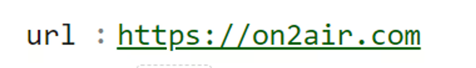
URL (Static URL)
Section titled “URL (Static URL)”Add a Static (never changes) URL to your button
- Add your URL in the url field in the Advanced settings
Link (Turn into Text-only link)
Section titled “Link (Turn into Text-only link)”Add a link style to the button - display as a text link
Tooltip
Section titled “Tooltip”Enter the Content of the tooltip
Classes
Section titled “Classes”Any Prime React classes to be added
💡
Learn more about this:  Style Your Forms and Fields - CSS Class Styling
Add a visual block before or after the input field with text or icon. Set the content, bgColor, or color for either the before or after or both
Group Button Icon
Section titled “Group Button Icon”Add an icon before or after the input field. Set the content, and location for the icon. Location options: left or right
Badges
Section titled “Badges”Buttons have built-in badge support with badge and badgeClassName properties.
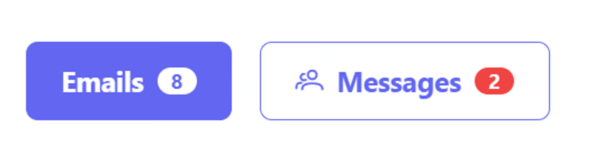
Badge = the badge on the button
BadgeClassName = the style of the badge
Link Open Options
Section titled “Link Open Options”By default, the button link will open in a new tab.
You can change the way a link opens to one of the following options
- open in the same tab/window (for non-embedded forms)
- open in the same tab/window (for embedded forms)
- open in a popup window
In the Button Field settings
- Go to Extra Options > Advanced Options settings for a Button field.
- In ‘location’ field, type in one of the 3 options:
self - open in the same tab/window (for non-embedded forms)
top - open in the same tab/window (for embedded forms)
popup - opens in a popup window
in popup, you can also set dimensions of the popup if you enter the sizes and sides similar to this: popup:left=100,top=100,width=320,height=320
Extra Options (Advanced)
Section titled “Extra Options (Advanced)”You can add additional formatting options to your form fields with our advanced options. Please note these are being added as needed and are not all documented yet. Please reach out to us via chat if you have any questions
- Click Extra Options > View Advanced Options
For Button options, see the list
PrimeReact | React UI Component Library
Section titled “PrimeReact | React UI Component Library”The ultimate collection of design-agnostic, flexible and accessible React UI Components.

primereact.org

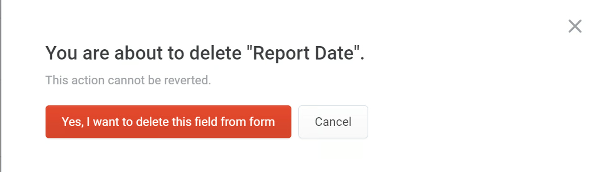
Danger Zone - Delete Field from Form
Section titled “Danger Zone - Delete Field from Form”Delete your field from the form
- Click Remove
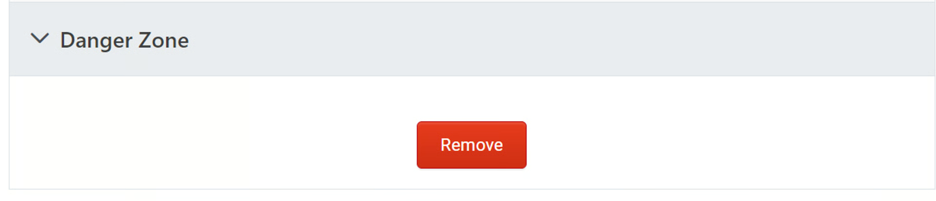
- Click Yes, I want to delete this field from the form