Customize Your Form Styles and Buttons
🔴 On2Air Forms has been shutdown to focus on our On2Air Backups Airtable app Learn more about automated Airtable backups - on2air.com
You can customize your form and buttons on your form with a custom button label, icon, background color, font color, padding, and other options.
In this tutorial
-
Customize Your Form
-
How to add Styles - The Basics
-
Submission Page Styles
-
Design the Form Header
-
On2Air Formula field Styles
-
Form Field Styles
-
Customize the Color of Your Submission Button
-
Customize the Color of Your Linked Record Buttons
-
Customize the Label on the Linked Record Buttons
-
Customize the Icon on the Linked Record Buttons
Customize Your Form
Section titled “Customize Your Form”We don’t have full themes or styles for forms yet, but you can still style your forms with our Extra Options settings with the Class field. Themes and Styles are on our product roadmap and will be implemented soon.
💡
See a full list of Styles available  Style Your Forms and Fields - CSS Class Styling
How to add Styles - The Basics
Section titled “How to add Styles - The Basics”Style are entered into Class fields found in the Extra Options menu on most pages and fields. Styles are Class names. View our Styles list and type in the ones you want.
💡
See a full list of Styles available Style Your Forms and Fields - CSS Class Styling

- To add multiple styles, add a space between the class names.

Submission Page Styles
Section titled “Submission Page Styles”- Go to the Page menu, then choose Extra Options menu and click View Custom/Advanced Options
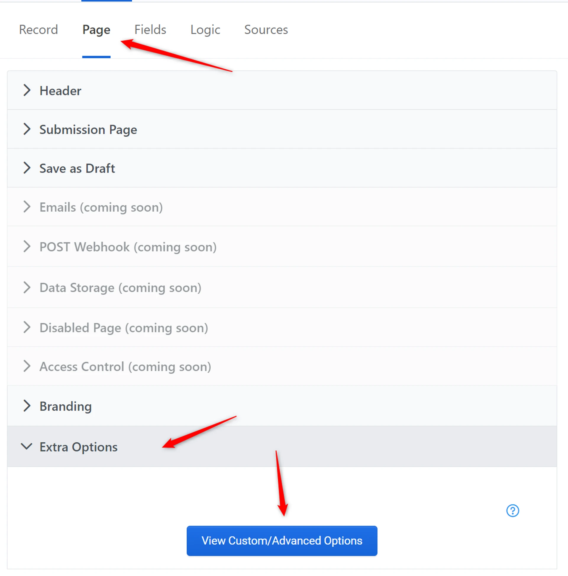
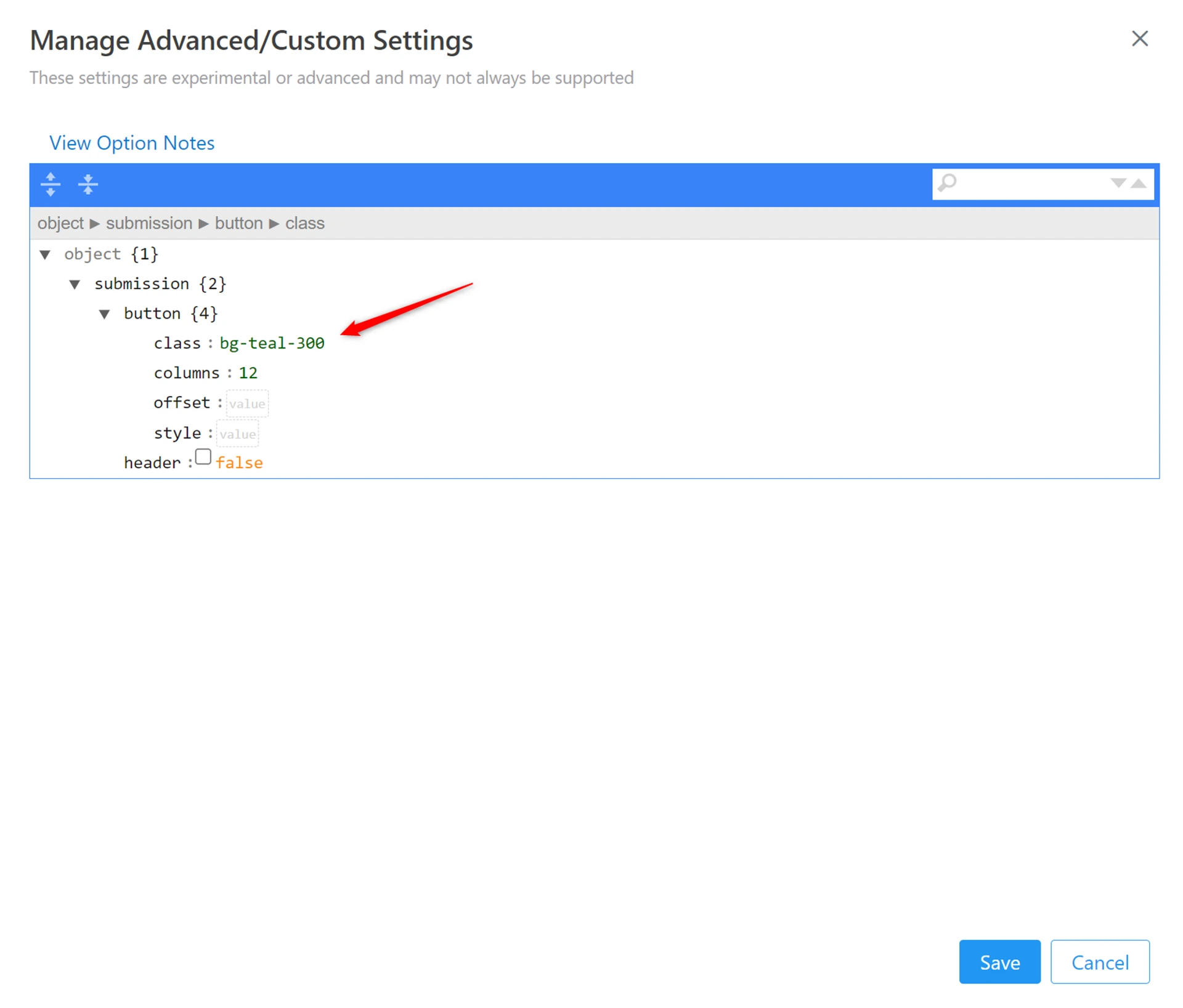
In submission > button, paste the color class name into the class field and click Save
- To add multiple styles, add a space between the class names.
Design the Form Header
Section titled “Design the Form Header”⚙
 Design the Form Header
On2Air Formula field Styles
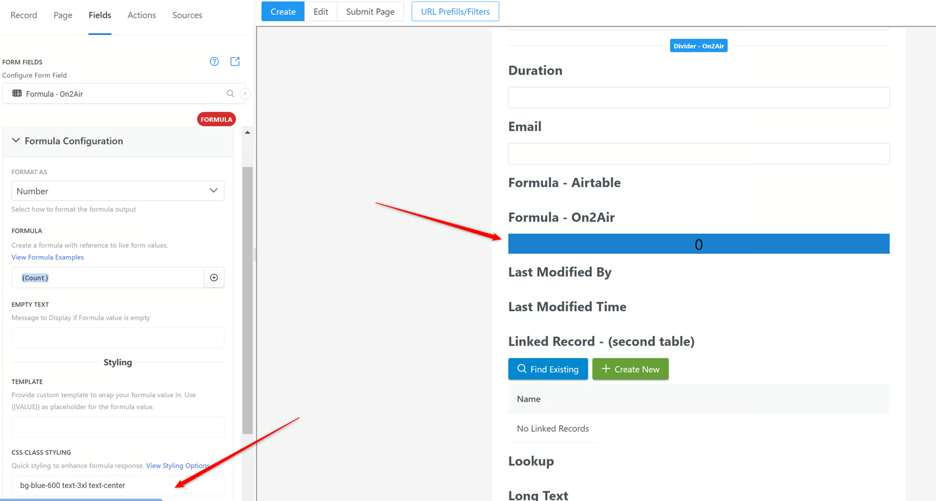
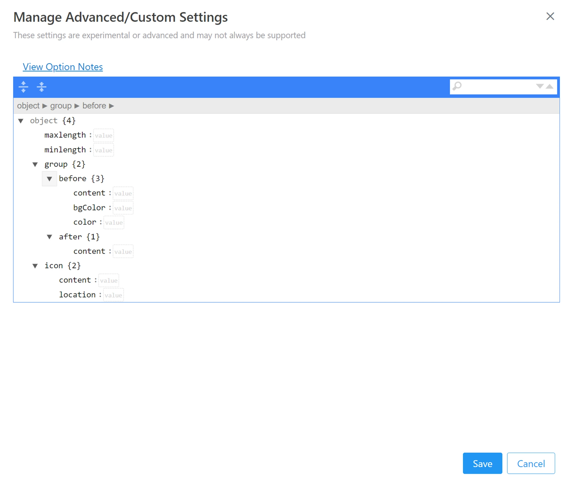
Section titled “On2Air Formula field Styles”Use the CSS Class Styling field
To add the style option, add the class name for the style you want. Class names are basic text and number classes. All you need to do is find the ones you want and type it in.
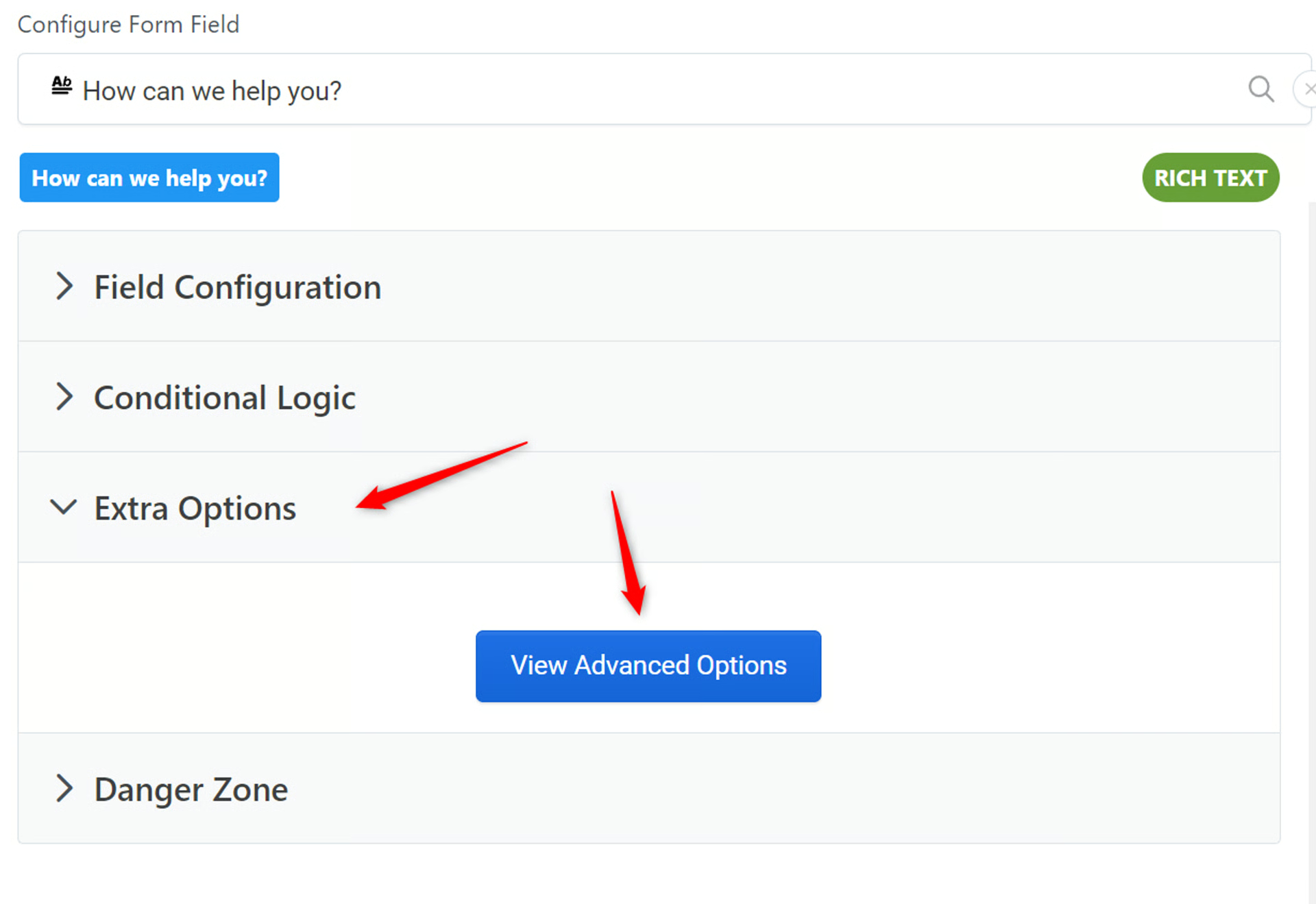
Form Field Styles
Section titled “Form Field Styles”Click your field > Extra Options > View Advanced Options. Please note that not every field has all available options
Customize the Color of Your Submission Button
Section titled “Customize the Color of Your Submission Button”- Choose a color from the list of colors at the link below
PrimeFlex
Section titled “PrimeFlex”Choose from a variety of colors for the background of an element. Classes Colors are derived from the Prime UI library theme being used via css properties. bg-primary background-color: var(—primary-color); color: var(—primary-color-text); bg-primary-reverse background-color: var(—primary-color-text); color: var(—primary-color); Examples surface-500 bg-cyan-500 bg-orange-500 Pseudo States Focus, Hover and Active states are available with the focus:, hover:, active: prefixes respectively.

- Copy the Class name of the color you want
Example: bg-teal-300
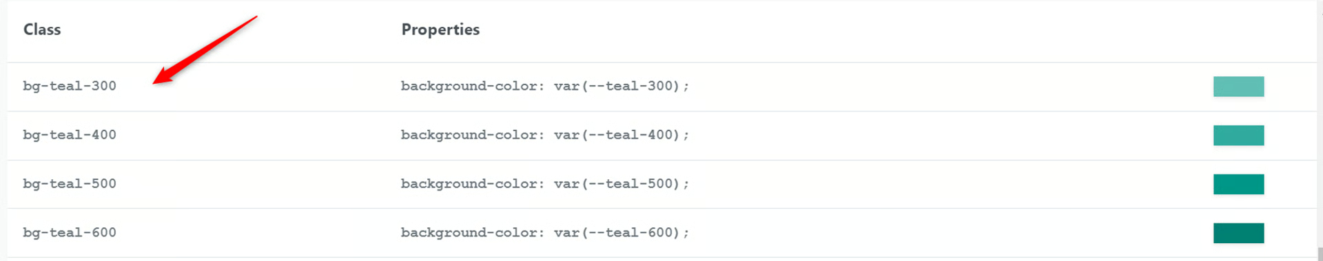
- Go to the Page menu, then choose Extra Options menu and click View Custom/Advanced Options

In submission > button, paste the color class name into the class field and click Save

- Your Submission button should now be Teal
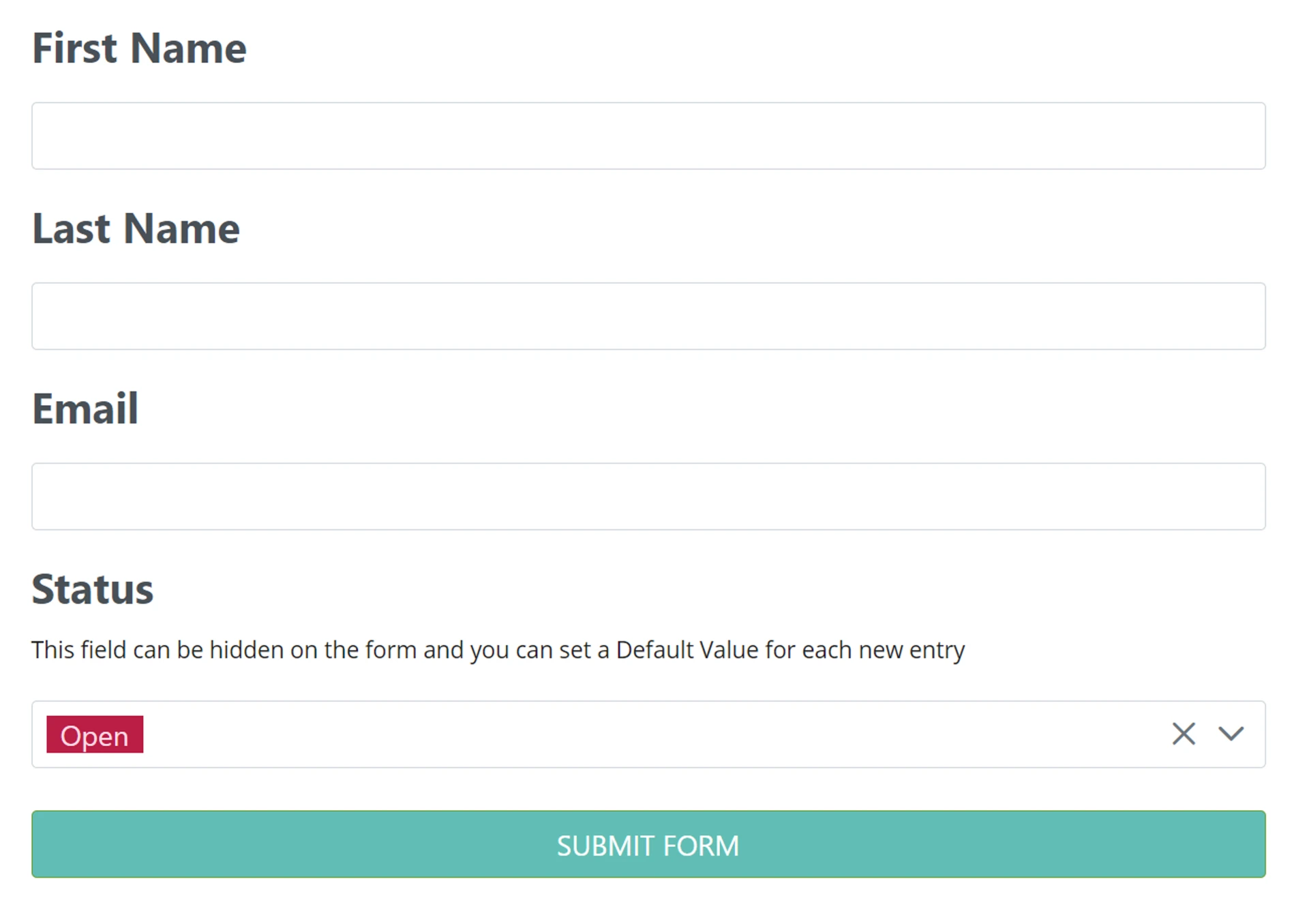
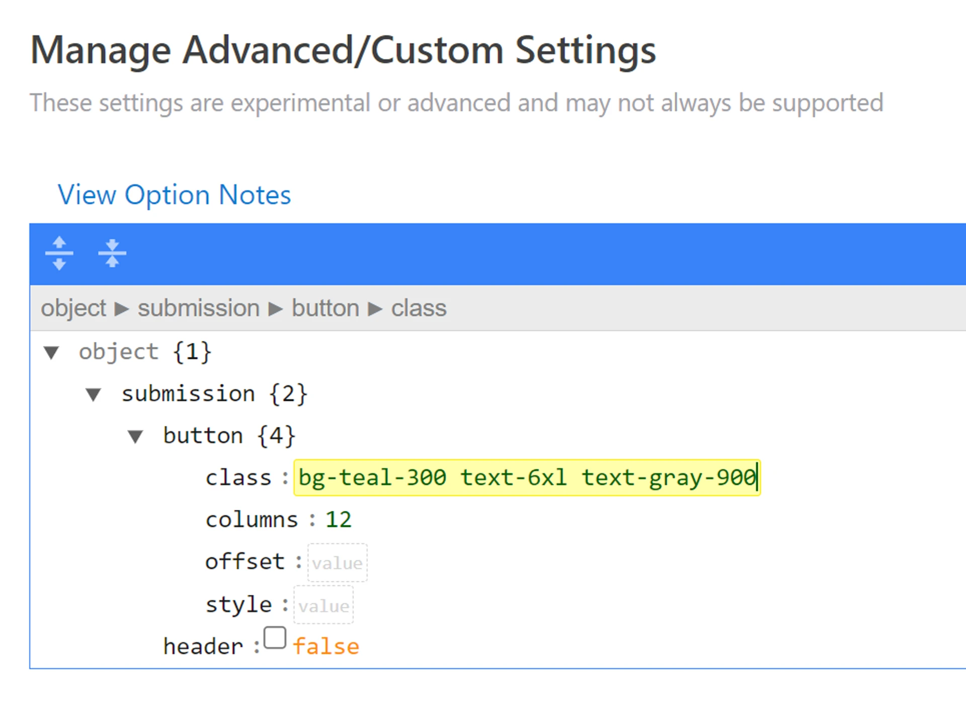
- To add multiple styles, such as the text color, padding, or other options, add a space between classes

- You can see multiple styles have been added to the button
💡
See a full list of Styles available Style Your Forms and Fields - CSS Class Styling
Customize the Color of Your Linked Record Buttons
Section titled “Customize the Color of Your Linked Record Buttons”You can customize the color of the buttons on your linked records.
To add a background color to your button:
- Open the Extra Options menu on your Linked Record
- Click View Advanced Options
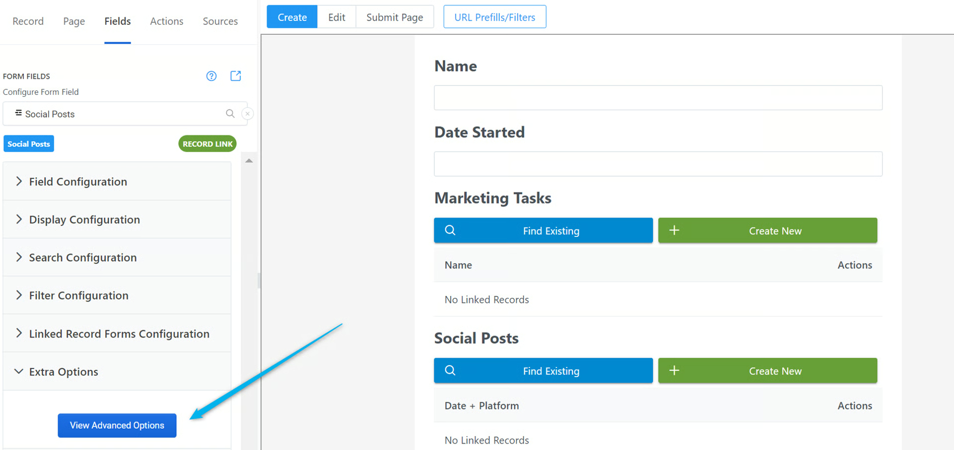
- Find the background color you want for your button from the page below
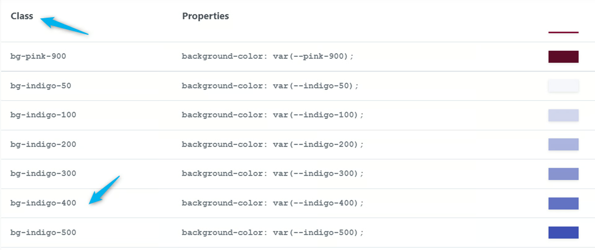
PrimeFlex
Section titled “PrimeFlex”Choose from a variety of colors for the background of an element. Classes Colors are derived from the Prime UI library theme being used via css properties. bg-primary background-color: var(—primary-color); color: var(—primary-color-text); bg-primary-reverse background-color: var(—primary-color-text); color: var(—primary-color); Examples surface-500 bg-cyan-500 bg-orange-500 Pseudo States Focus, Hover and Active states are available with the focus:, hover:, active: prefixes respectively.
- Copy the Class name from the color you want
Example: I want indigo 400, so I copy the class bg-indigo-400
-
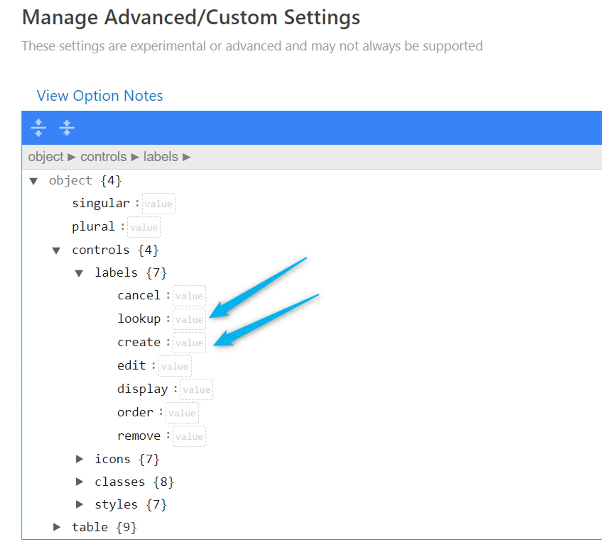
In Advanced settings, open controls > classes
-
You’ll see a list of the different buttons available
-
create
-
cancel
-
lookup
-
edit
-
display
-
order
-
remove
-
grouping
-
Add the corresponding class color to the button where you want the color changed
Example: I added bg-indigo-400 to the lookup button to change the lookup linked records button
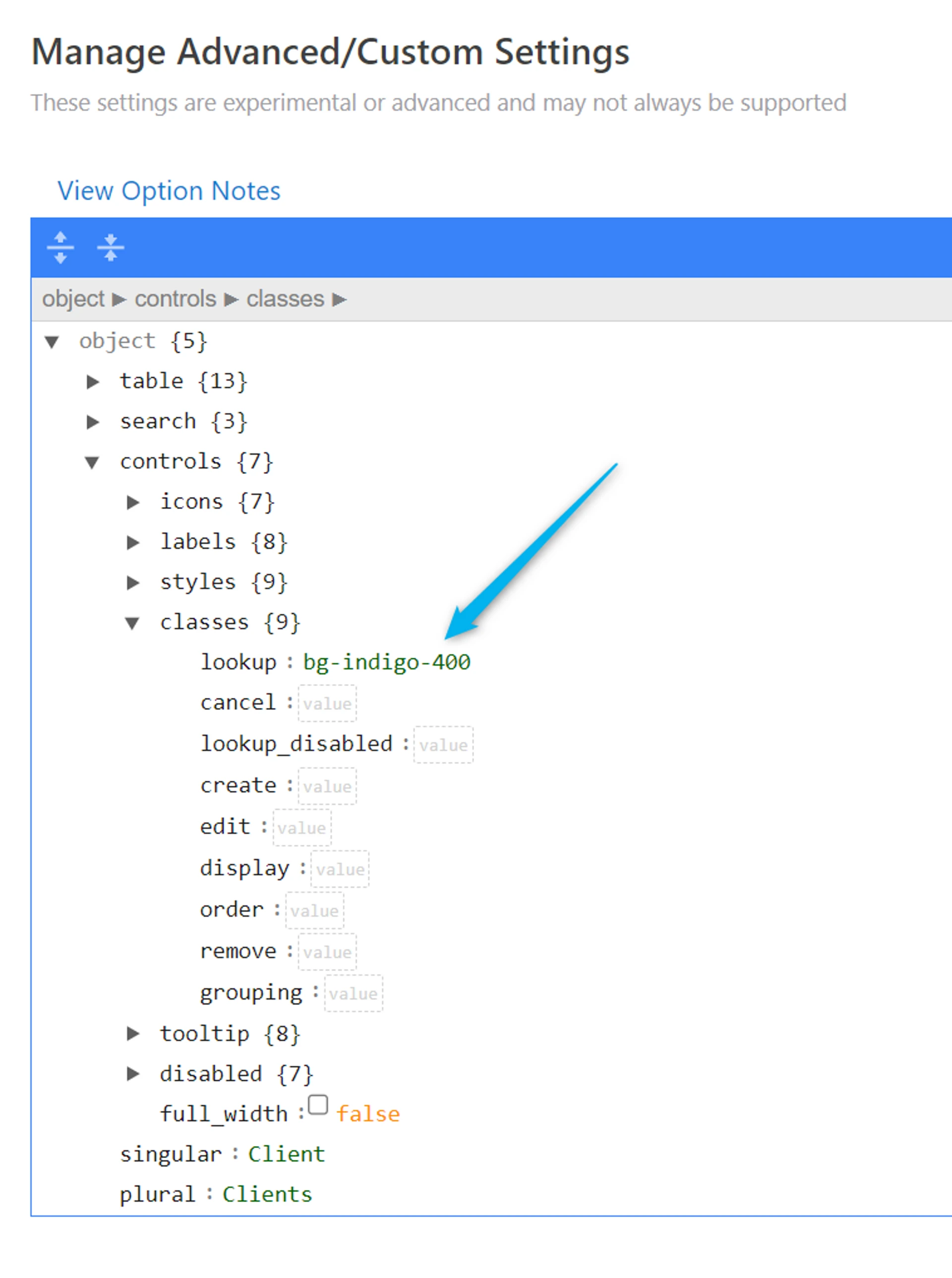
- The lookup button background color is now the indigo color
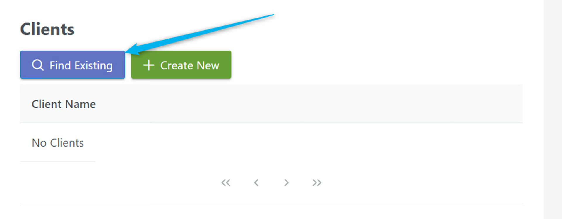
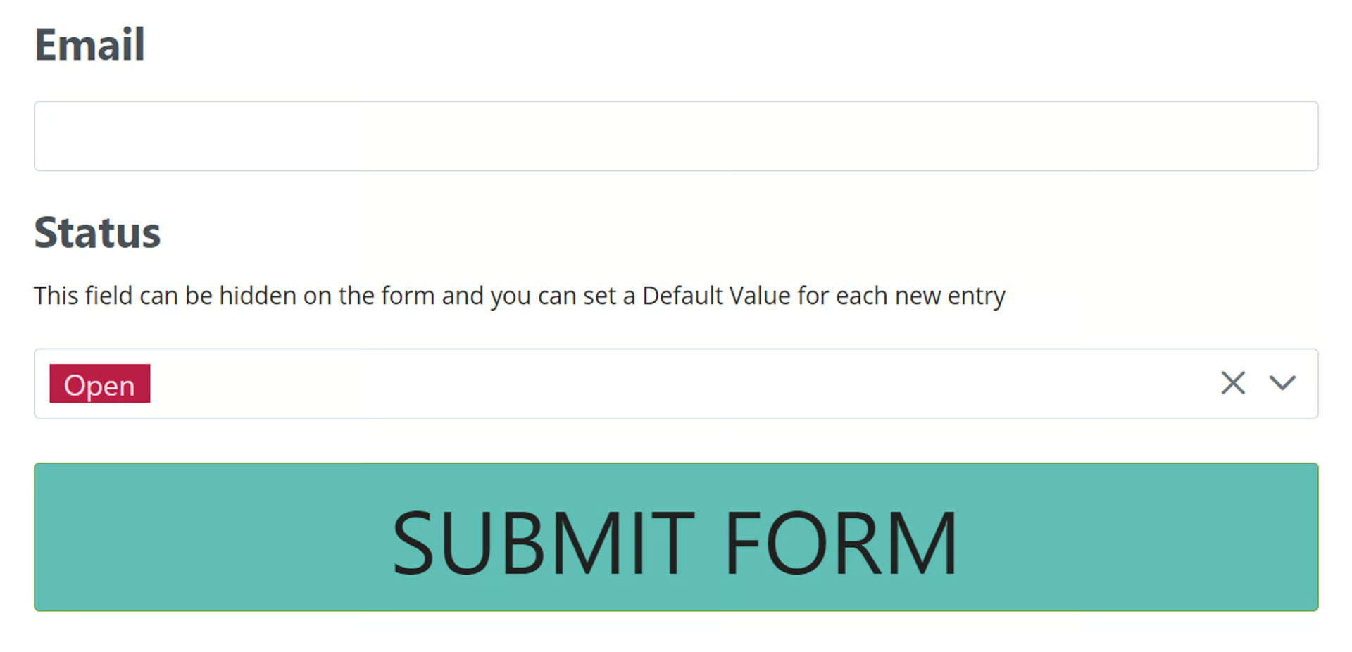
Customize the Label on the Linked Record Buttons
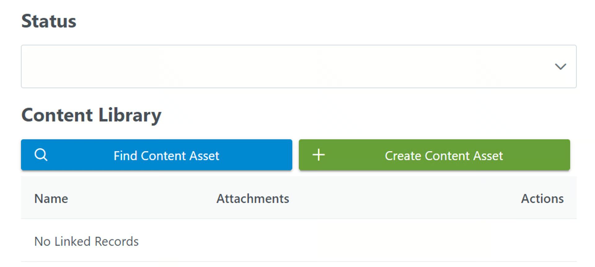
Section titled “Customize the Label on the Linked Record Buttons”Example: In a Linked Record field called Content Library, I want to add my own label and icon to the buttons.
Here’s what it looks like as the default button setting with no customization:
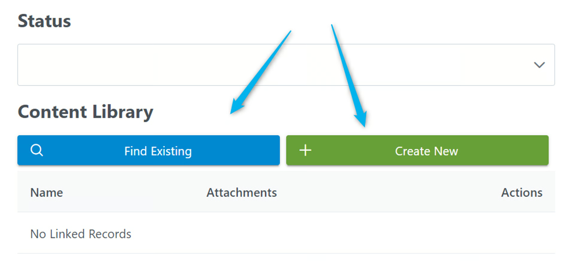
I want to add a different label on the record lookup button (blue) and the create new (green) button
- In the Extra Options, I choose the labels option for lookup and the one for create
- Type in the desired labels for the buttons in in the value field, then click Save
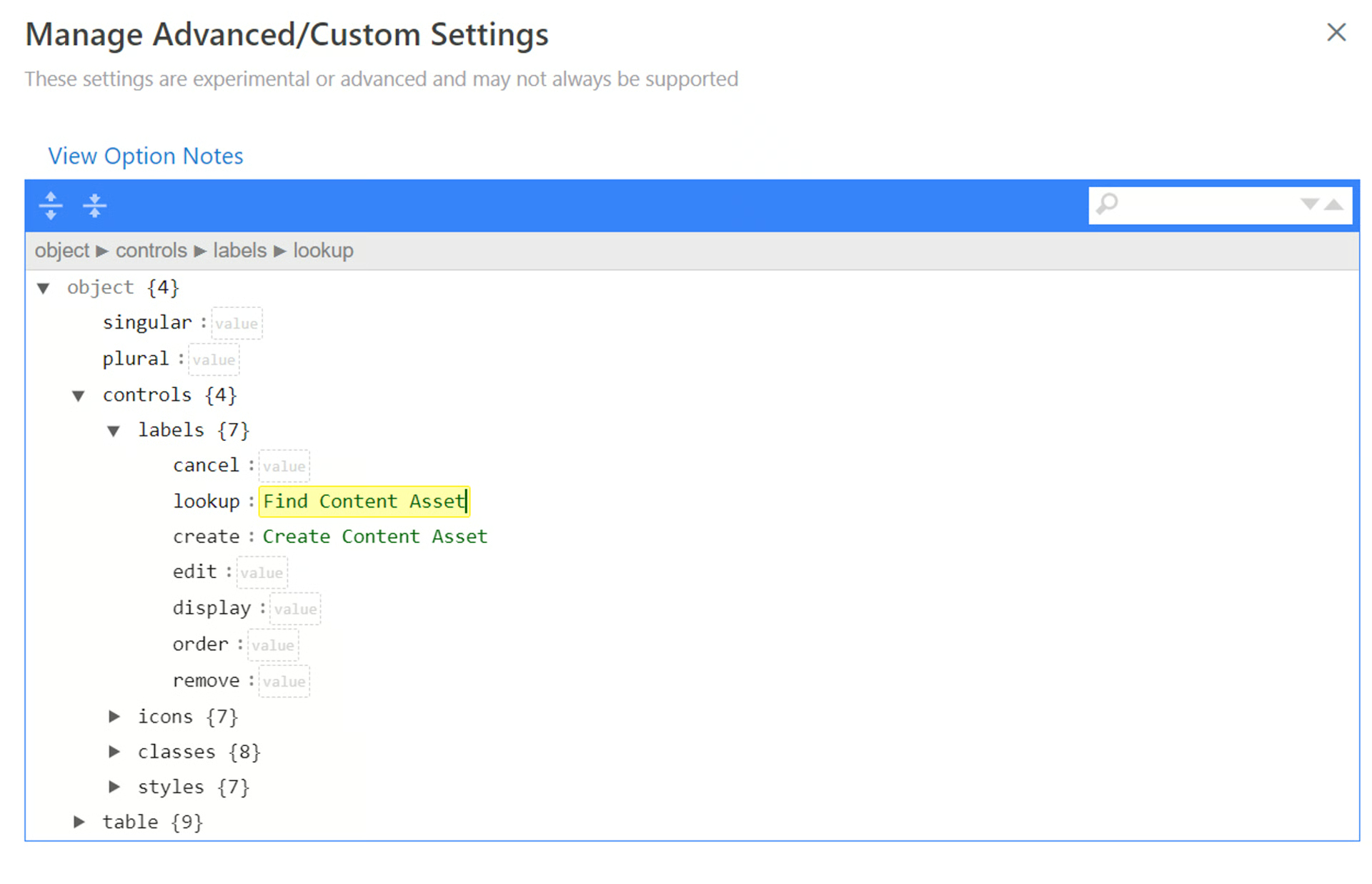
- Now, we have custom labels for the buttons!
Customize the Icon on the Linked Record Buttons
Section titled “Customize the Icon on the Linked Record Buttons”Next, we’ll add a different icon to the buttons
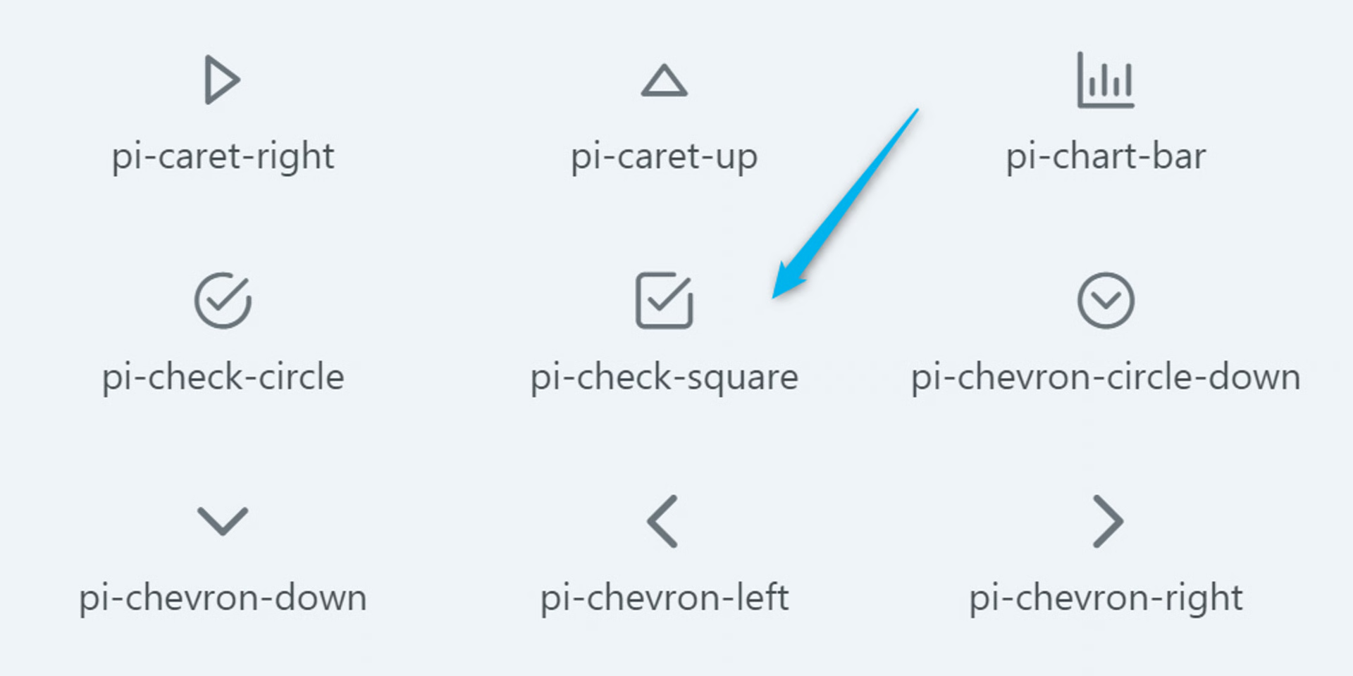
- Choose an icon from the list:
PrimeReact | React UI Component Library
Section titled “PrimeReact | React UI Component Library”PrimeReact components internally use PrimeIcons library, the official icons suite from PrimeTek. Download PrimeIcons is available at npm, run the following command to download it to your project. npm install primeicons Then import the library. import ‘primeicons/primeicons.css’; Getting Started PrimeIcons use the pi pi-{icon} syntax such as pi pi-check.

primefaces.org

Let’s choose the checkbox icon. You can see underneath the icon, there’s a shortcode.
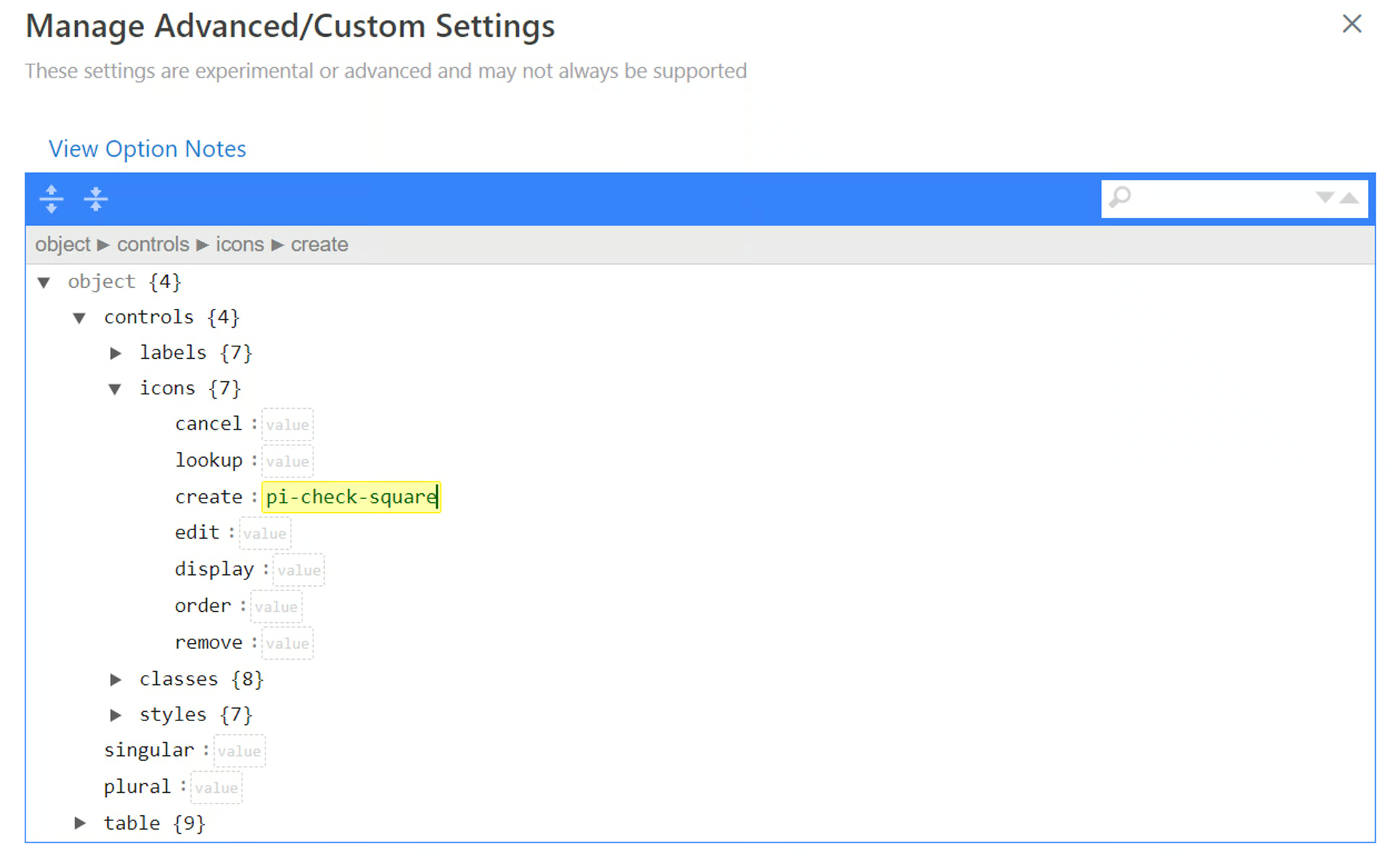
- Copy the shortcode, pi-check-square
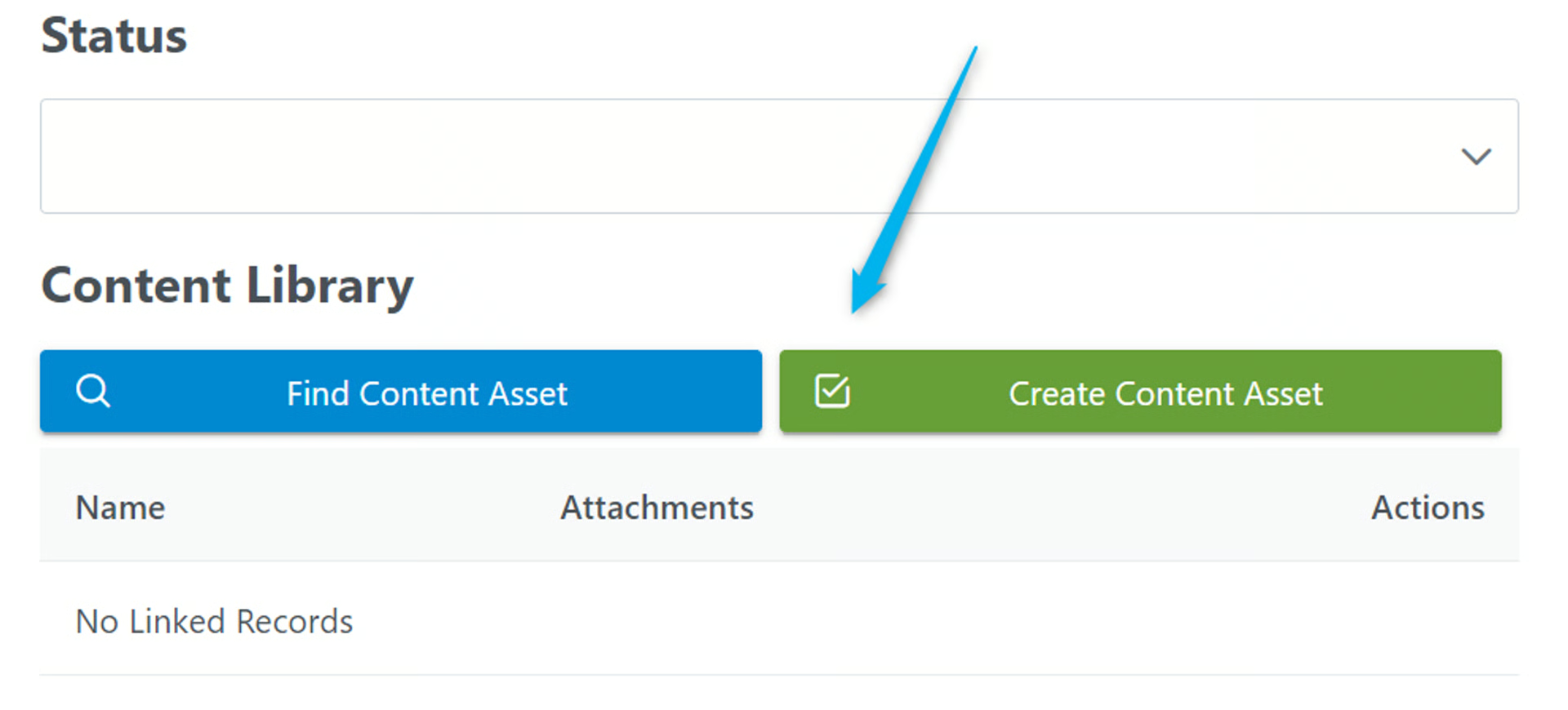
- Paste the shortcode into the _icon_s > create field and click Save
- Now, there’s a checkbox icon on the ‘Create’ button!
If you are having trouble with custom options, reach out to us. We will guide you in the right direction.